Structure and Nature
Sanna Kannisto
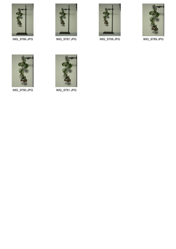
Finnish artist Sanna Kannisto (born in 1974) explores in her photography the theories and concepts with which we approach nature in art and science. In so doing, she uses both the methods of representation in art as well as the methods of the natural sciences. Her characteristic photographic works were made during numerous stays in Peru, French Guiana, Brazil, and Costa Rica. Plants and animals are studied, staged, and photographed in stage like portable “field studios.”
|
|
|
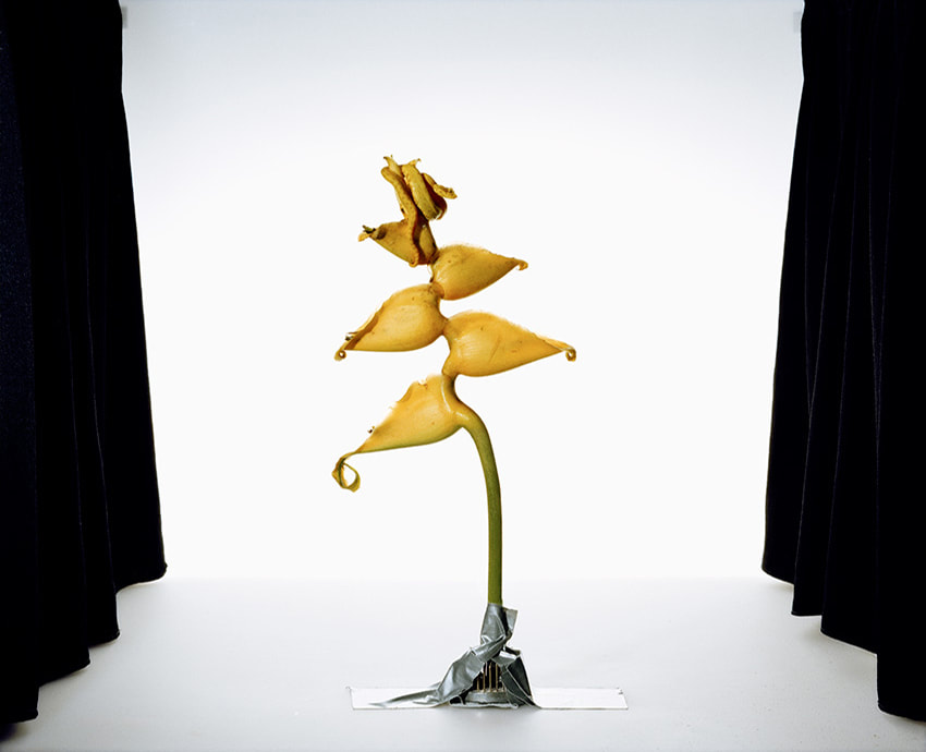
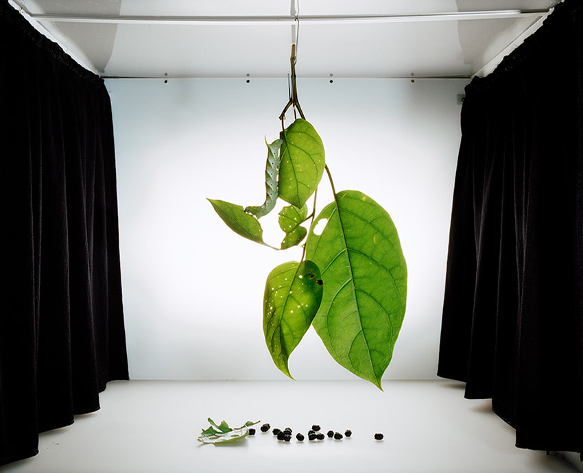
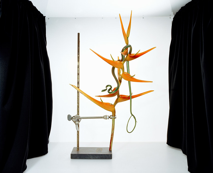
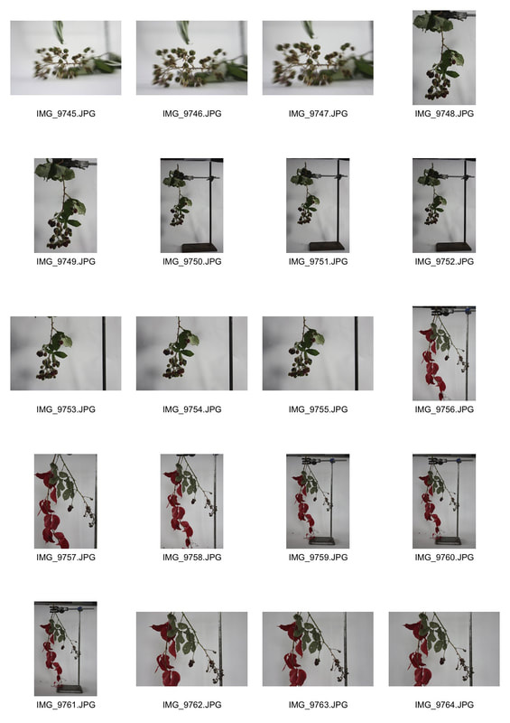
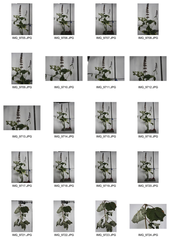
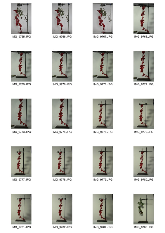
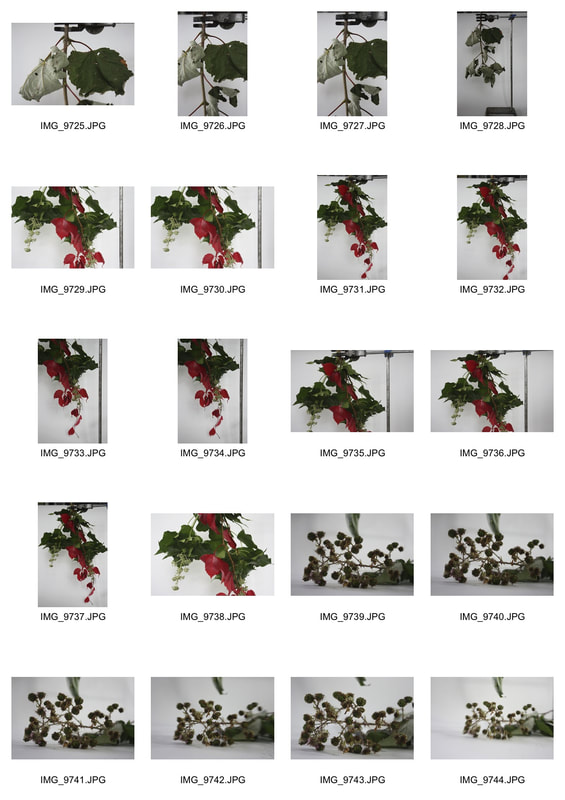
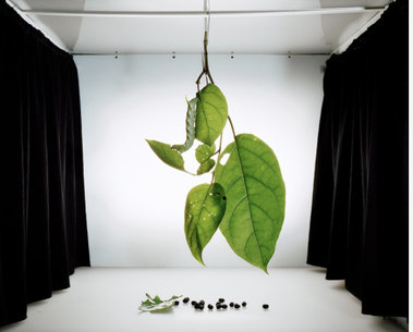
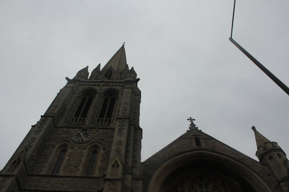
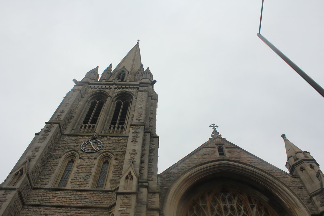
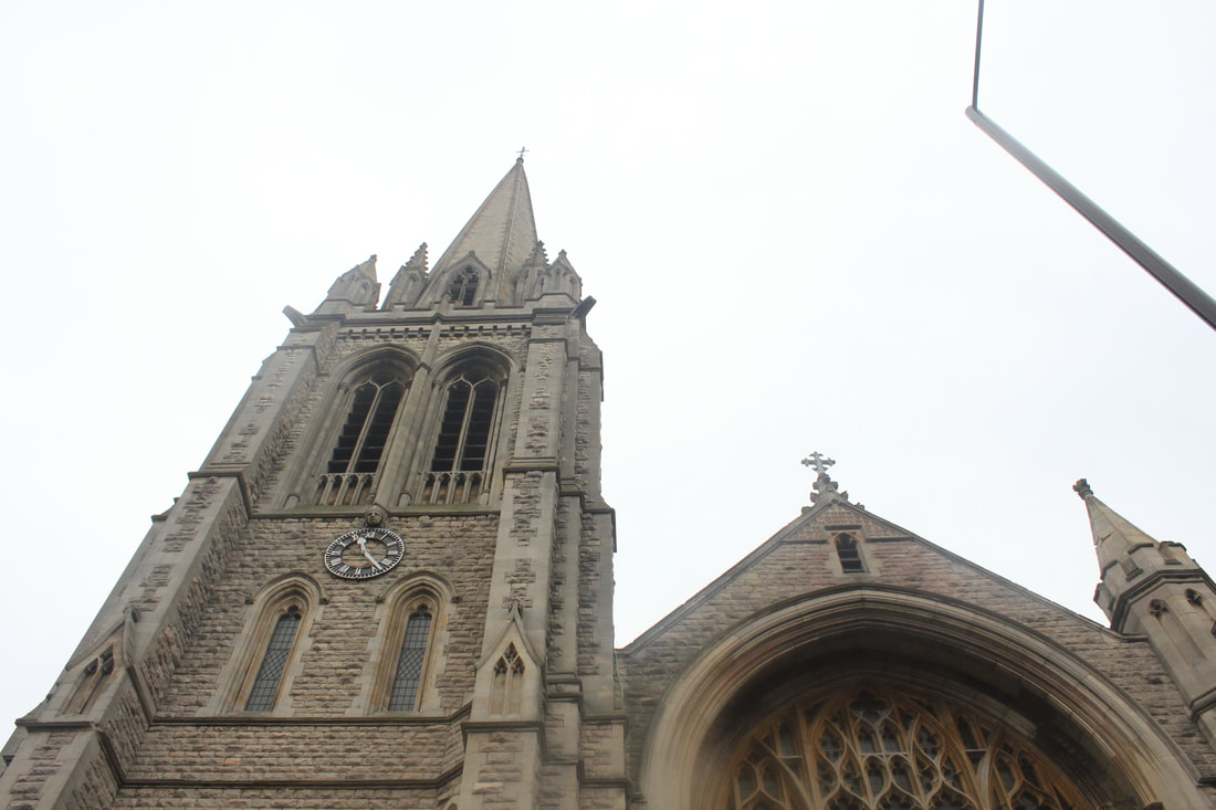
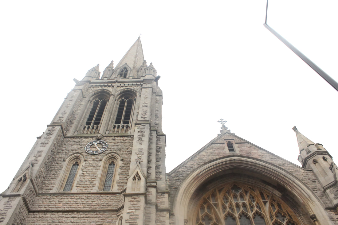
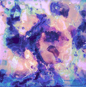
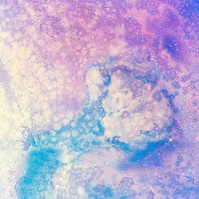
In this series of Sanna Kannisto's work an observer would be able to see a brightly lit auditorium like set up. Placing emphasis on the subject in the centre. The white background framed by the black curtain like sides creates contrast and reflects the set up of a science lab. Fieldwork explores the dialectics of nature and culture in both artistic and scientific contexts. The core practice of the natural sciences is to collect in order to view more closely in the service of public knowledge. Collecting suggests taming and containment, traits shared to some extent by photography. Breaking away from the practice of scientific documentation which typically presents samples in isolation and devoid of context. Kannisto's work addresses the process of staging and image-making.
In this task I was required to take both close up and far away shots of nature against a white background. The white background creates a scientific ambiance which is inspired by Sanna Kannisto. Sanna Kannisto constantly challenged the boundaries between science and art and created an equilibrium which can be seen in her collection.
First Response
|
|
|
Artist and Me
|
|
Sanna Kannisto (left) creates a whole scene with her work, she shows her product as though it is in a whole room and uses the sides frame it. As I didn't have the same resources I was not able to do this however, I believe my photography inspired by this work was mostly successful. I believe the main issue was not in the practical side but the editing side. In some images, the leaves seen heavily edited. On the other hand, in this image (right) you can see the direct reproduction of Sanna Kannisto's work.
WWW: I think that the photographs which I selected best showcased the variety and the contrast
EBI: If I was to do this again I would choose a different time of day so the editing wasn't needed so much as I feel that some of the editing ruined the natural beauty of the plant and the image itself
EBI: If I was to do this again I would choose a different time of day so the editing wasn't needed so much as I feel that some of the editing ruined the natural beauty of the plant and the image itself
Architecture
For this task, we had to take still pictures whilst experimenting with different ISO's from 100-6400. As the ISO increases in number, the brightness of the image increases. Depending on the subject, at the two polar ends of the spectrum, you may see nothing as it may either be completely white or completely black. The optimum ISO changes depending on the vocal point of the picture.
First Response
IS0 100
|
ISO 200
|
ISO 400
|
ISO 800
|
ISO 1600
|
ISO 3200
|
ISO 6400
|
|
|
|
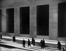
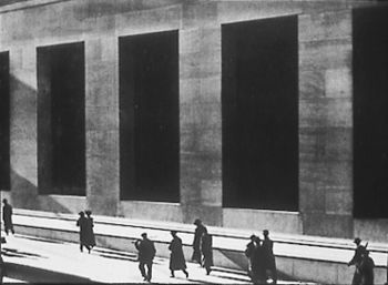
Paul Strand
Paul Strand was an American photographer and filmmaker who, along with fellow modernist photographers like Alfred Stieglitz and Edward Weston, helped establish photography as an art form in the 20th century. His diverse body of work, spanning six decades, covers numerous genres and subjects throughout the Americas, Europe, and Africa.
|
|
|
Among Paul Strand's early works, Wall Street (centre image) is recognised by collectors and scholars as an icon of modernism, an image that redefined the art of photography. This world-famous image is among the most often reproduced masterworks of photography. Of all the great photographers of the twentieth century, Strand most truly embodies the aspirations and spirit of his age. For more than sixty years, he created photographs that are a result of concentration on essentials, purity, passion, and precision in a form that sustains these qualities as a lasting inheritance. Strand's work has been exhibited worldwide and is represented in major collections, including the National Gallery of Art, Washington, D.C.; Philadelphia Museum of Art; Metropolitan Museum of Art and Museum of Modern Art, New York, among others.
Second Response
For our second response we shifted our focus from ISO to more abstract art. Our goal was to carefully select scenery which showcased levels and created an interesting frame
|
|
|
Artist and Me
|
|
Paul Strand (left) uses a wider, less abstract scene to photograph, on the other hand. In my work (right), I chose to create more of an abstract scene, editing it to produce the same colour scheme as Paul Strand. Compared to Paul Strand's work I believe mine is interesting as it was my take on what he has done. However, if I was to attempt to create a direct reproduction of his body of work, I would use existing forms instead of creating abstraction.
WWW: I think that I manipulated the images I took well, I like the contrast I created and the transformation from the original image
EBI: If I was to do this again I would do more close up shots, this would allow me to create more contrast on a focused object, the juxtaposition would be more clear and I would be able to manipulate the image further
EBI: If I was to do this again I would do more close up shots, this would allow me to create more contrast on a focused object, the juxtaposition would be more clear and I would be able to manipulate the image further
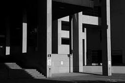
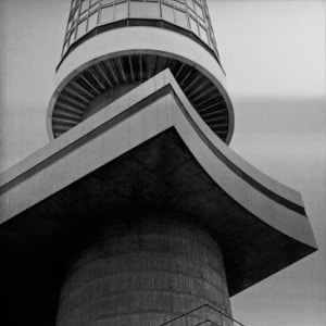
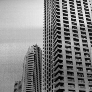
Brutalism
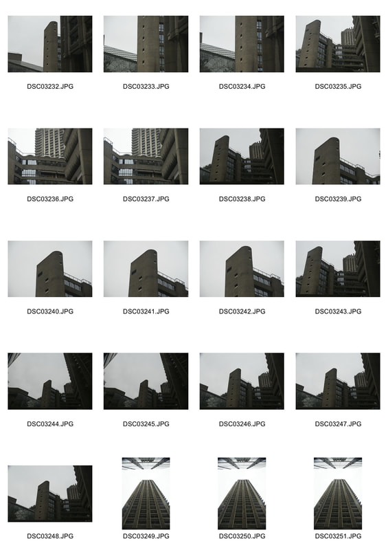
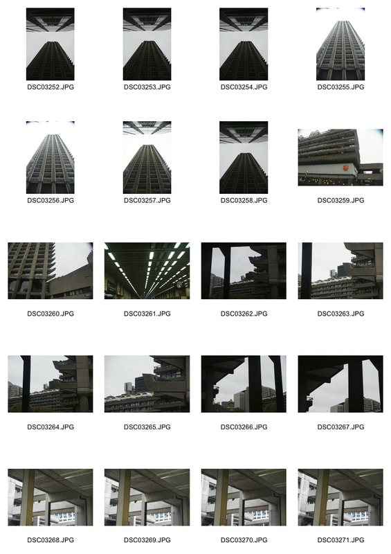
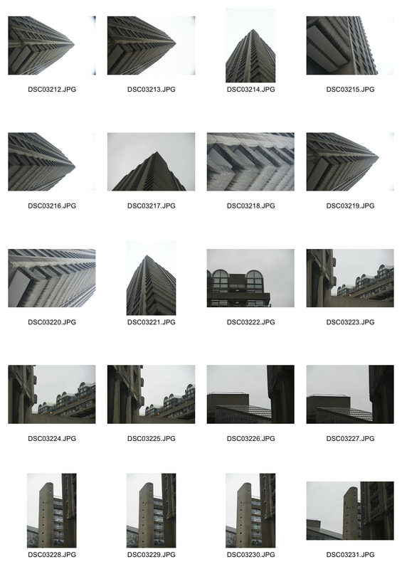
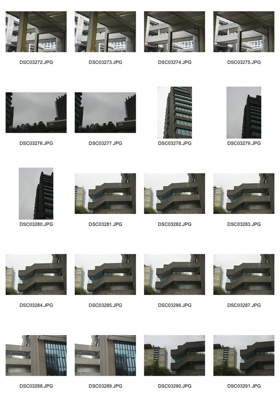
For this task, we had to visit some of the Brutalist structures in London, from the list I chose:
- The Institute of Education
- The Barbican
- Brunswick Centre
- Royal College of Physicians
- The Institute of Education
- The Barbican
- Brunswick Centre
- Royal College of Physicians
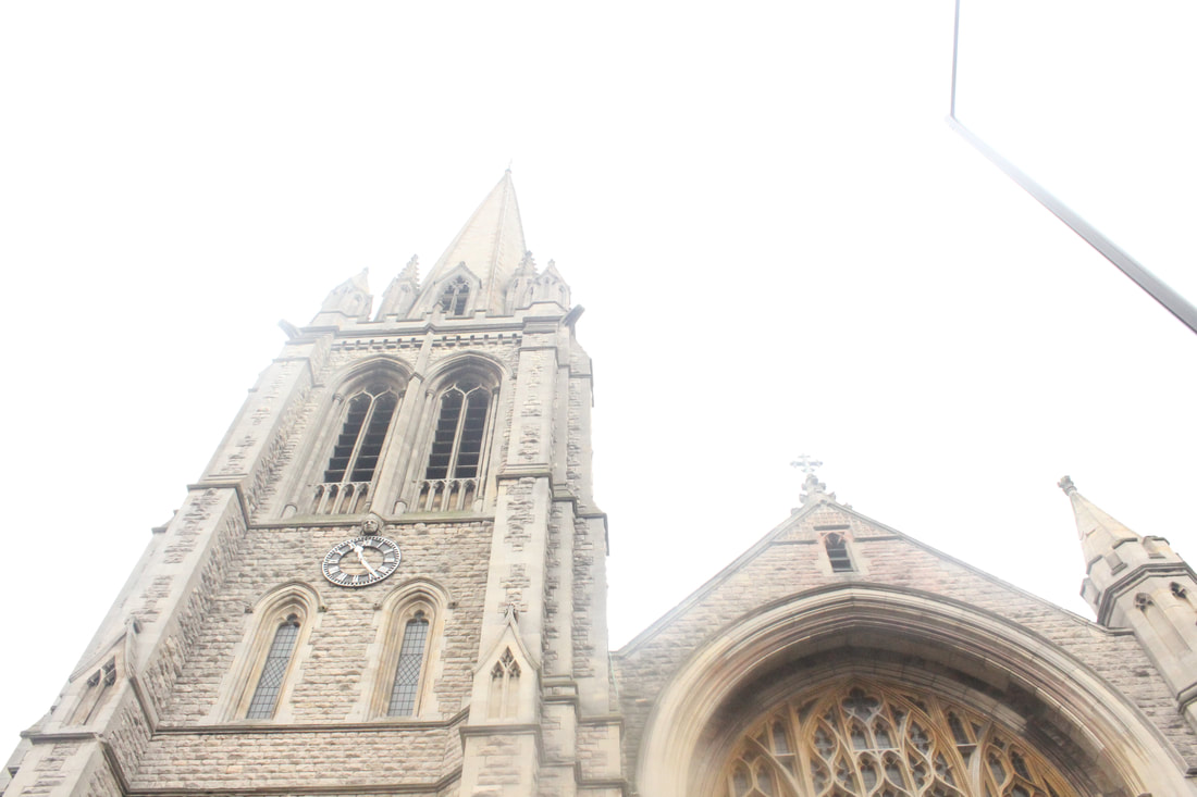
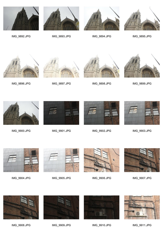
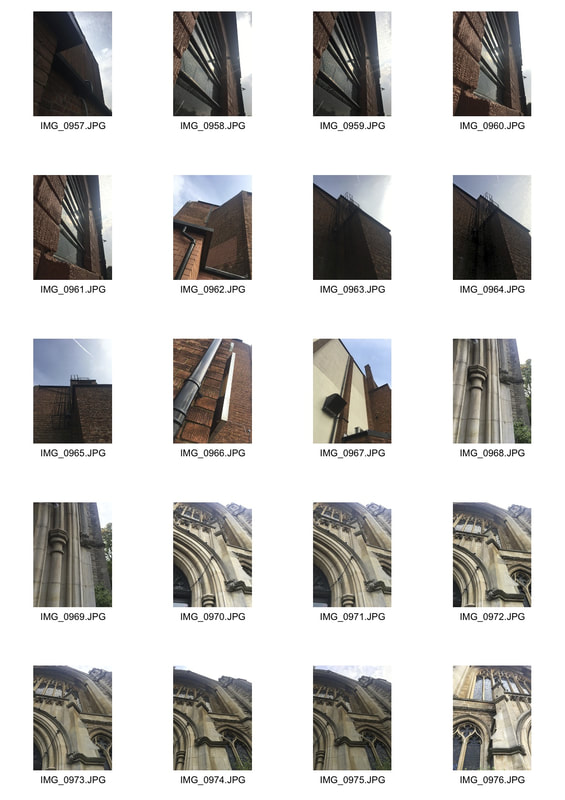
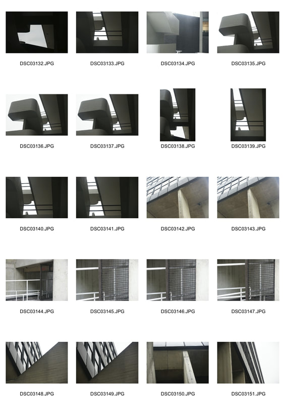
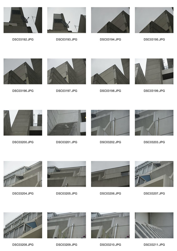
The intention of the task was to capture the Brutalist architecture in many different ways to place emphasis on the different elements. Personally, I wasn't satisfied with just visiting one building as I felt that it didn't give me an accurate idea of what Brutalist structures actually entail.
Brutalist architecture evolved from the 1950's to the mid-1970', descending from the modernist architectural movement of the early 20th century. The term originates from the French word for 'raw'.
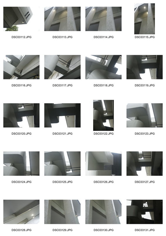
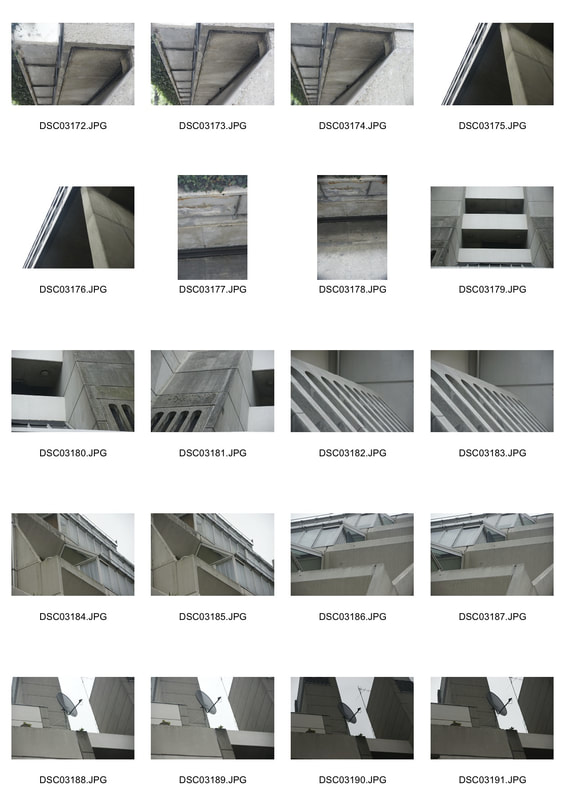
I found that to capture the Brutalist architecture to the best ability, it was best not to have other distractions in the shot, this is why in my photos I liked to use blank space, I also felt like this put emphasis on the contrast and shapes. I also preferred taking more close up shots rather than a zoomed out photo of the whole building, this preference is reflected in my photos
Brutalist architecture evolved from the 1950's to the mid-1970', descending from the modernist architectural movement of the early 20th century. The term originates from the French word for 'raw'.
I found that to capture the Brutalist architecture to the best ability, it was best not to have other distractions in the shot, this is why in my photos I liked to use blank space, I also felt like this put emphasis on the contrast and shapes. I also preferred taking more close up shots rather than a zoomed out photo of the whole building, this preference is reflected in my photos
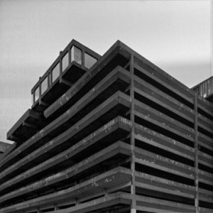
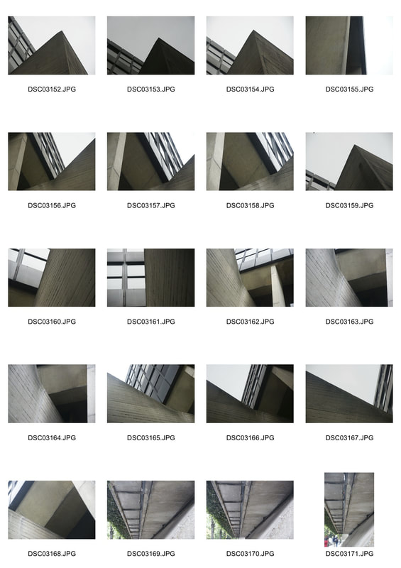
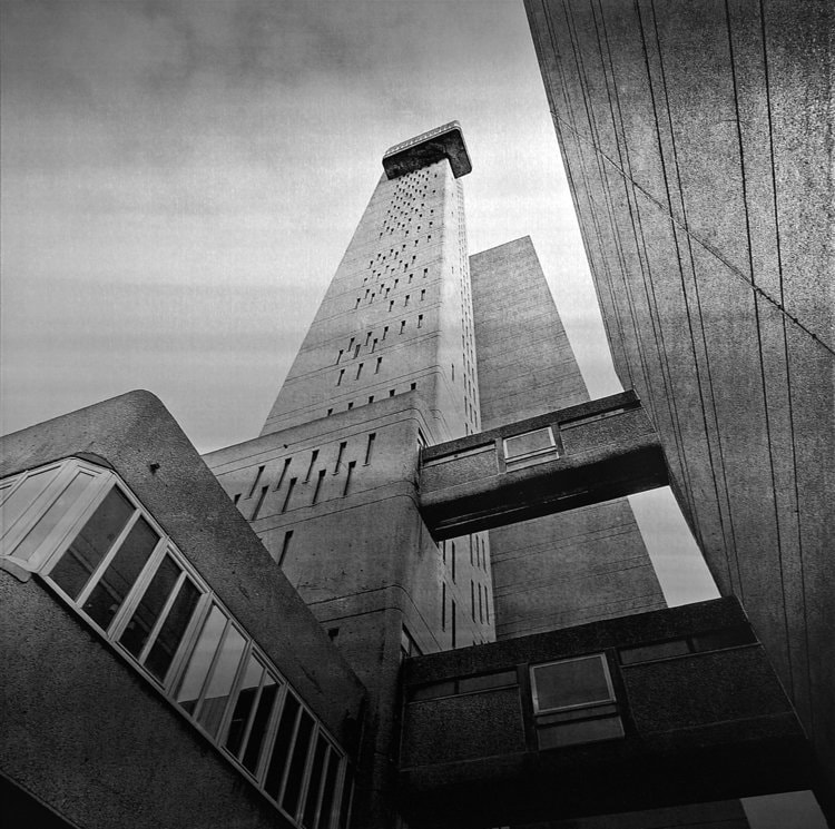
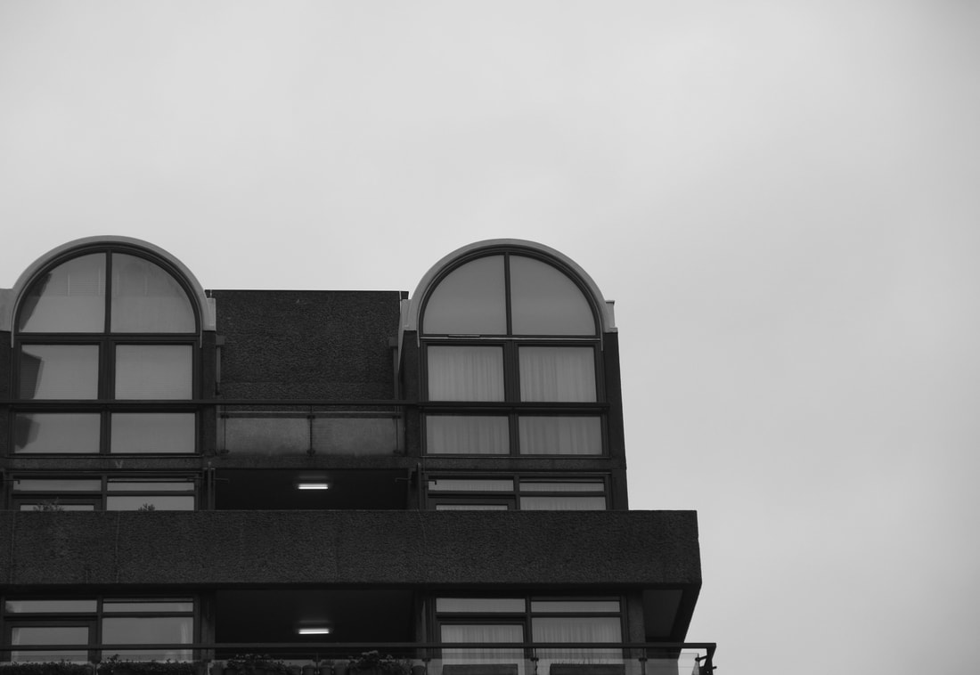
Simon Phipps
Simon Phipps is a fine art photographer operating in the UK. The photography by Simon Phipps provides a unique perspective and portrays Brutalist architecture in a sensitive, realistic and distinctive manner. Phipps has spent the last 15 years photographing and documenting Brutalist and buildings in the UK, creating a survey of photographic images that demonstrate the breadth of this contentious architectural style.
Phipps also made clear that his concerns are to to document and present post 1945 modernist British architecture that (loosely) fits into the idea of the social contract, that the state would provide housing and municipal buildings for the people. This is one part of what makes Brutalism so unique. Its creation had many goals, but arguably the most important one was municipality and the idea that these were functional, government buildings that served a very specific purpose and their design was meant to reflect that.
"I have photographed a number of buildings that sit within a loose Brutalist principle and rather than present them as photographic prints have produced them as monochrome images printed directly onto an aluminium substrate. I felt this would capture the idea of ‘valuation of materials “as found”, whist aluminium also resonates with concrete as a material in it’s visual neutralness. In 1957 Gio Ponti argued that architecture both as ‘plastic and abstract fact, is colourless’. Concrete as a material would seem to have the neutral qualities to illustrate this observation and it is this very lack of colour in the brutalist prints that allow us to judge the forms as architecture."
- Simon Phipps
|
|
|
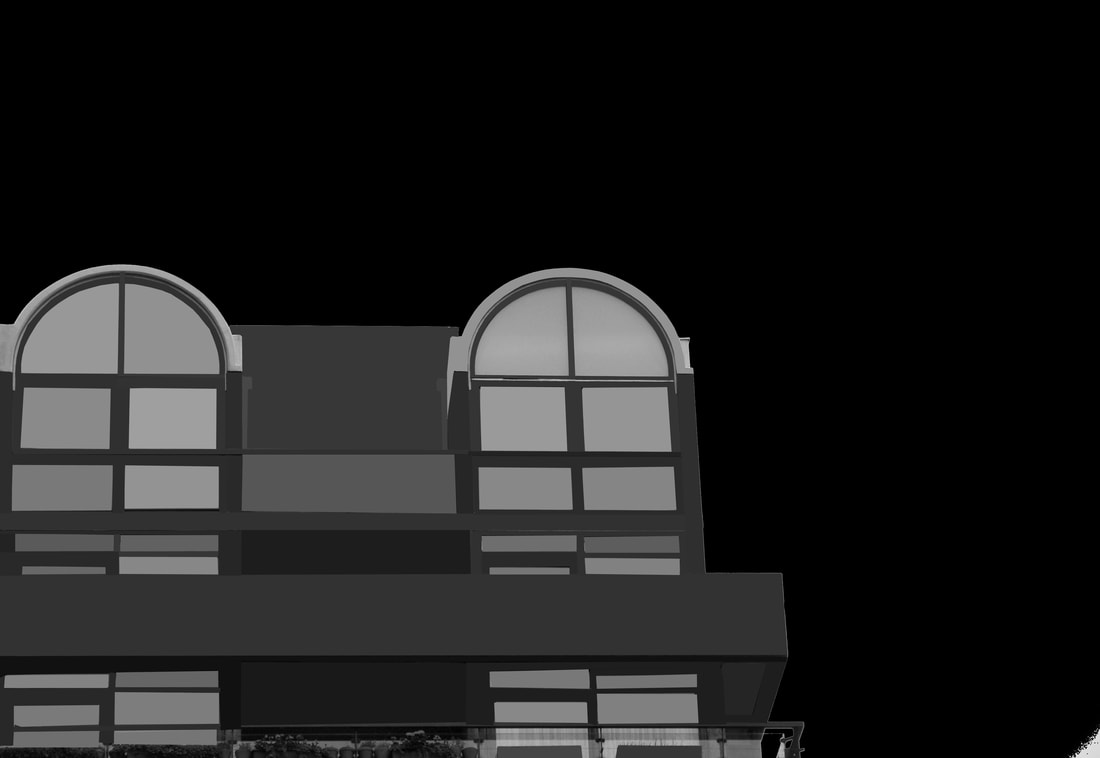
In all three of these images, Simon Phipps uses angles and knowledge about form and structure to capture the buildings in a way to highlight the brutalism. Often he can be seen photographing a building where two sides meet, this creates an interesting perspective and shows more than one view of the building. Once these photos are put into black and white they seem more impactful. Personally, I think this is because the contrast in black and white places emphasis on the structure and bland colours included in the structure.
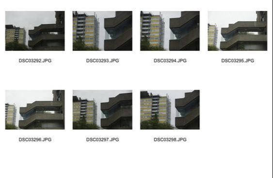
The Barbican
|
Selects
|
Edits
|
Brunswick Centre
|
Selects
|
Edits
|
Institute of Education
|
Selects
|
Edits
|
Royal College of Physicians
|
Selects
|
Edits
|
|
|
|
Artist and Me
|
|
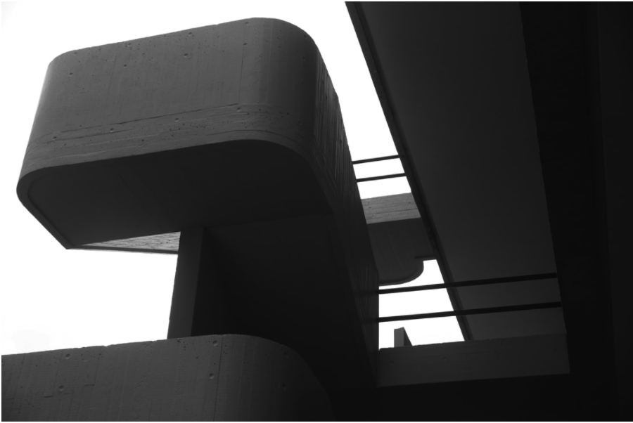
Simon Phipps (left) creates abstract images using interesting angles of buildings. In my body of work inspired by Simon Phipps you can see a clear translation of the techniques he uses and the colours that are prominent. In these two specific images , you can see many similarities, for instance, the connection between two forms, in the artists work, this is a simple rectangular form with different shades. In my work it is railings, I believe this adds texture to the image furthermore, I like the combination of rounded and sharp edges portrayed in both images. This contrast mellows the harshness of both the sharp angles and the monochrome colour scheme.
WWW: I believe that I achieved good angles and visited multiple Brutalist structures in order to gather the best images
EBI: I could have possibly focused on less structures and gathered a wider range of photos. By doing this I could of had more subjects to edit and a larger work piece
EBI: I could have possibly focused on less structures and gathered a wider range of photos. By doing this I could of had more subjects to edit and a larger work piece
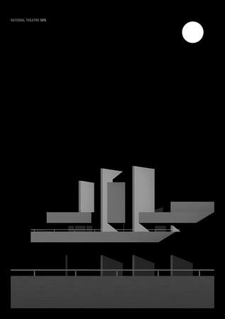
Thomas Danthony
Thomas Danthony is a french artist based in London. Often narrative, Thomas's work is characterised by a clever use of light, bold compositions and a dose of mystery.
|

|
|
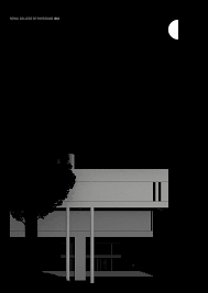
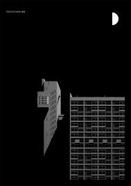
In all of Thomas Danthony's creations from this series the main feature is the colours. The use of the 'average' tool places emphasis on how bland the colours incorporated into brutalist architecture are. Moreover, it also creates a sense of a futuristic world where all building a free from imperfections. The final piece after all the editing is aesthetically pleasing. Furthermore, the use of the black background and the white moon like structure creates the contrast needed to make the building stand out further as the main vocal point.
Brutalism Extension Task: based on Thomas Danthony
For this task we had to use photoshopping tools to create a piece of work that was inspired by Thomas Danthony's work. The tool used on photoshop was called "average", where it creates an average colour of the items you've selected. This places emphasis on the bland colours that is incorporated in Brutalist architecture.
|
|
How to complete in photoshop
1. Select the image you would like to edit and drag it into photoshop
2. Select the 'polygonal lasso tool' and select an area which you would like to edit
3. After selecting the area carefully, select the drop down bar called 'filter', select 'blur', then 'average'
4. Repeat steps 1-3 until your whole image is averaged
2. Select the 'polygonal lasso tool' and select an area which you would like to edit
3. After selecting the area carefully, select the drop down bar called 'filter', select 'blur', then 'average'
4. Repeat steps 1-3 until your whole image is averaged
Artist and Me
|

|
Thomas Danothony (left) creates a sleek, realistic edit of buildings. My work, as an amateur wasn't as sleek as Danthony's. Mine could be viewed as more of an experiment. Upon viewing, you can see the resemblance between the two images and where the inspiration came from however, the use of photoshop needs to be refined before creating a successful reproduction of Thomas Danthony's body of work.
EVOL
German street artist EVOL transforms banal urban surfaces into miniature lifelike buildings. He is like an urban planner, but unlike the others, he creates a city within the city.
The artist uses complicated stencils to quickly transform power boxes, and other worn urban surfaces into miniature apartment buildings or other structures. By drawing tiny balconies and satellite dishes onto the side of an electrical box, he is able to turn it into a realistic tiny skyscraper.
EVOL’s works are so precise that, when you’re glancing at photographs, it sometimes might be hard to tell that you’re not looking at pictures of real buildings.
The artist creates miniature buildings within different cities and has even been commissioned to do installations in galleries, and while the police might not agree with this street art project, they probably enjoy the end result.
My Interpretation
|
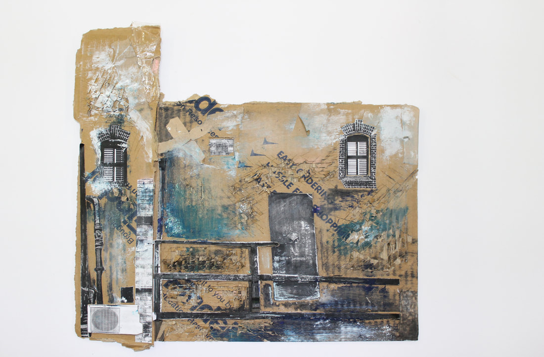
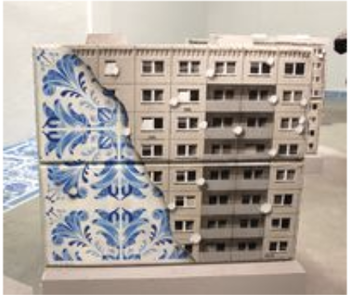
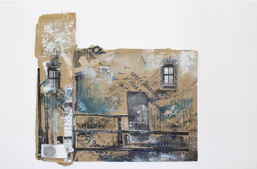
I used cardboard to create by building, to create more layers in my building I cut out windows so they were set out and protruding. Once this was completed I added colour with different utensils until I was happy with the result, I used acrylic paint and printing ink as well as using a scalpel to scratch and distress my image. I prefer my image after I worked into it as i feel it captures EVOL's street artwork more accurately. I also believe it has more character and isn't as recognisable as a cardboard box. |
Artist and Me
|
|
Evol (left) chooses to create his building, then put it in a realistic situation. I failed to put it in a realistic situation which was my main downfall. However, I believe I created an interesting building using a lot of different textures, however, Evol's work looks more refined compared to mine which looks more like an art project. Evol's body of work is fascinating and showcases pure skill in how he creates them. My reproduction of this is clear yet, I failed to make it look like a realistic building like Evol.
Strands
Strand 1: Organic Structure
Karl Blossfeldt
Karl Blossfeldt (June 13, 1865 – December 9, 1932) was a German photographer, sculptor, teacher, and artist who worked in Berlin, Germany. He is best known for his close-up photographs of plants and living things, published in 1929 as, Urformen der Kunst. He was inspired, as was his father, by nature and the ways in which plants grow. He believed that 'the plant must be valued as a totally artistic and architectural structure.'
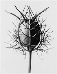
In this image, one can see a poppy seed head. The photographer may have wanted us to consider the beautiful structures created in nature itself. These structures not needing to be manipulated in order to showcase full beauty. Moreover, the Blossfeldt may be considering the link between human nature and mankind. This is shown by the emphasis placed on the veins of the plant. These veins share a striking resemblance to those of humans and are purposely highlighted by the contrast introduced to the image. A viewer may find this possible link interesting due to the fact it relates to them personally. Furthermore, this link and the visual cues shown may probe other personal memories attached to the subject. The photographer has used a digital camera to obtain the sharpest image. To do so I expect that he used a macro lens in order to capture the poppy seed head up close. The sharpness of the image combined with the contrast against the light background creates an aesthetically pleasing image.
|
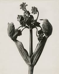
In this image you can see a relatively symmetrical plant. Additionally, the photographer may have wanted us to consider the ideas that surround the link between symmetry and beauty. The simplicity of the image suggests the natural beauty does not need to be controlled in order to exhibit its beauty to the full extent. Furthermore, Blossfeldt may be considering the link between nature and human anatomy. For example, this plant could strongly resemble ovaries in a human. This concept would place the seeds in the image at the forefront. A observer may find this possible link interesting due to the fact it relates to their body personally. Moreover, this link has suggestive connotations with life and fertility. Both of these positive connotations create a favourable ambience and make the image more appealing. The photographer used a digital camera to obtain a distinct image. The distinctiveness of the image against the off-white background creates a mellow mood and reflects the complex ideas that may follow.
|
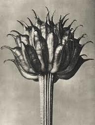
In this image, one individual would be able to see a globeflower fruit. The photographer may have wanted us to consider the structure of the leaves and how they have formed. The little contrast throughout the image may suggest that the fruit is already the main subject of the image and this importance does not need to be amplified via colour editing. Furthermore, Blossfeldt may be considering the link between this fruit and other food, for example, this fruit could be confused with an artichokes facade. This is due to the leaves formation and the small stem. In addition, one could also confuse this fruit with a baby pineapple, although this is harder to envision, the leaves of the globeflower fruit are very similar to that of a blooming pineapple. The photographer has used a digital camera to allow easier access to editing and to allow him to take multiple shots and choose the best. This choice would also create a more refined image. The minimal contrast creates a more solemn impression.
|
All three of these images captured by Karl Blossfeldt reinforce his idea about how plants should be valued for their architectural structure. In addition, his inspiration gained from his father creates a whole new level of relation between the artist and a viewer, which overall plays a dramatic role in the connection with the art.
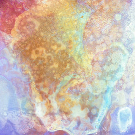
Ajay Malghan
|
Ajay Malghan is an artist of Indian descent raised in America, his practice focuses on the abstract and physical engagement with his materials. After stints in Hong Kong and Austin, he is now based in Baltimore. His work has been featured by Wired, NPR and National Geographic.
This camerless body of work was created by putting fruits and vegetables between glass plates and using them as a negative. “By utilising colour, the works abstract the viewer and remove the otherwise ordinary fruits and vegetables from their context. As photography is deeply rooted in science; these images extract the camera and allow us to see the ordinary in new ways while blurring the lines between art and science. As our food is more processed and more steps are introduced between farm and table, the colour added becomes ironic with art imitating life.” - Ajay Malghan |
|
More in-depth life story
When he was 20, Malghan was diagnosed with leukaemia, and went through chemotherapy. The side effects of the chemotherapy caused a bone disease, which meant that the majority of his 20's were spent learning to walk. He found that photography was a release- he was confined for so long with no freedom that when he was well again he felt that he was viewing the world from a different perspective, and wanted to capture this through photography. During university, Malghan was fascinated by the dark room because he found that developing photographs was more hands on than digital ,and created a more intimate relationship between the photographer and his photographs. He started experimenting with food- slicing it very thin and putting it under the enlarger, and then manipulating the photograph and experimenting with colour. The photographer finds food interesting because it is involved in ever day life- for many people, the day is revolved around meals, and we need food to exist. As well as being what we need to live off, food is also Malghan's inspiration, because he finds it fascinating how something so simple can be made into something so complex. He then experimented with glass plates- putting food such as lettuce between glass plates and then painting and manipulating the photographs. He found that the most difficult foods to photograph were often the most rewarding. Malghan also experimented with fast food, which changed his perspective on fast food completely- he said that he no longer eats cheeseburgers because after photographing it he found that there was no definition or pattern to the meat, which it should have because it is made from cow. What Malghan found most interesting about photographing food was the similarities between the food and other magnified objects- for example, he found that a strawberry had a similar shape to an MRI scan.
THE SPACE WITHIN from Dark Rye on Vimeo.
|
|
|
Ajay Malghans series of 'bleaching' showcases the intensity his subjects. In all three of these pictures the vibrant colour almost reflect those of a holographic image. This attracts attention as well as making it aesthetically pleasing. The artist may be wanting us to consider how all three of these show food that we eat that has been manipulated. Moreover, it could be an awakening to some that we should look deeper at what we are consuming instead of just viewing it at face value.
My approach to Organic Structure
I chose organic structure as my first strand because I was inspired by natural order, I experimented a lot with different techniques and subjects. Along the way I worked out the best lighting, lenses and position in order to obtain the best image to represent my vision.
Firstly, I chose a selection of fruit that I thought had interesting shapes or structures, whilst choosing these I came to the realisation that all of the subjects I had chosen reminded me of human flesh and the human anatomy as a whole, this is a link I would like to pursue if I get the chance in the future.
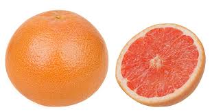
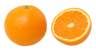
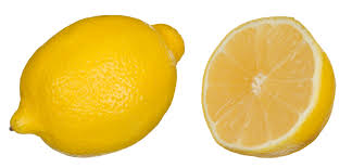
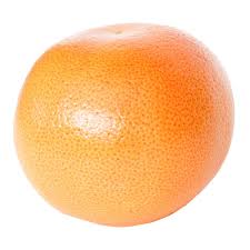
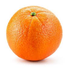
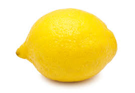
The fruit I chose was, pink grapefruit, oranges and lemons.
|
|
|
Throughout the time I was looking for inspiration regarding my subjects I came across many images of mushrooms close up. I found this very interesting and decided to pursue it as an experiment. Pursuing this as an experiment was key to me as I liked the link between all three citrus fruits and was dubious to the idea of introducing a foreign vegetable.
|
Whilst initially taking photos I came up with the idea to use a light box underneath my subjects in order to create the most contrast and highlight the natural elements. After picking up my light box I immediately knew it was something I wanted to utilise. This was something I used throughout my photos as it proved to be the best source of light and it successfully showed the subjects complex structure. However, it also caused issues regarding the ISO and the lens. My vision before I started was to capture the structure of each individual element close up. To do so I couldn't use my normal lens as it was too varied. I had to go and pick up a macro lens in order to be able to capture the raw and natural components successfully. Although, this was time-consuming i believe it was the best decision as without the macro lens I would not have been able to fulfill my pre-conceived ideas of the outcome efficiently. |
|
|
The first fruit I photographed was lemons. This was before I started using a light box. It is clear how this image is not what I envisioned before I started. I then took some time away to brain-storm different ways to place emphasis on the beauty and structure in more detail without modifying massive amounts. |
|
|
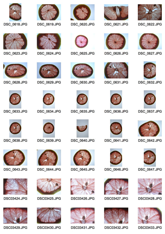
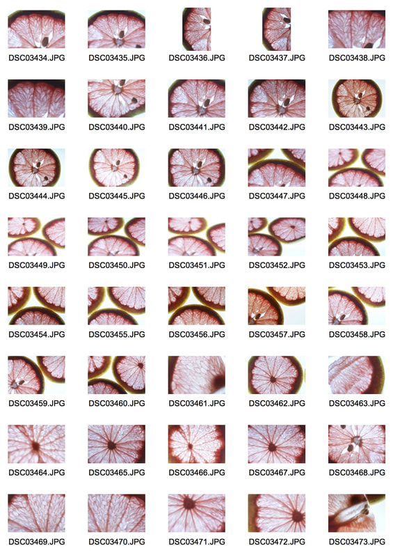
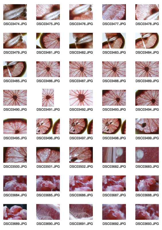
Pink Grapefruit
I found that photographing pink grapefruit was the most successful. Moreover I also find it the most interesting as it shares a striking resemblance to an orange however, once cut open, it presents an array of vivid colours that speak for themselves. I found the bright colours against the light box worked the best.
|
|
|
Selects
|
Edits
|
|
|
|
|
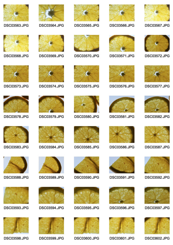
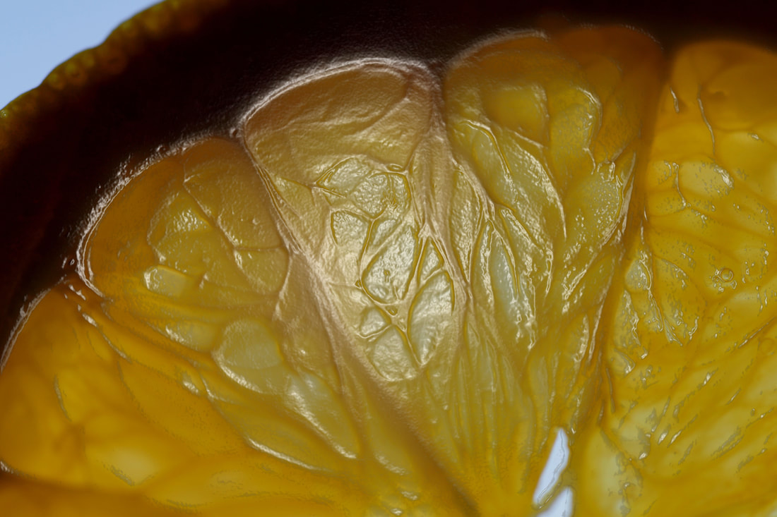
Oranges
I found that photographing oranges was quite successful. However, it took me a while to work out which type of slicing of the orange itself would portray the best. Once I had mastered this, everything ran smoothly. I believe just like the pink grapefruit, the brightness of the flesh speaks for itself.
|
|
|
Selects
|
Edits
|
|
|
|
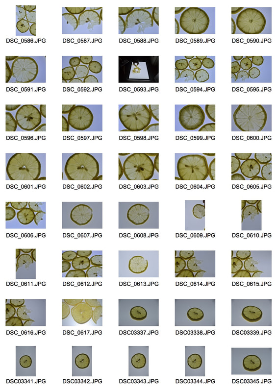
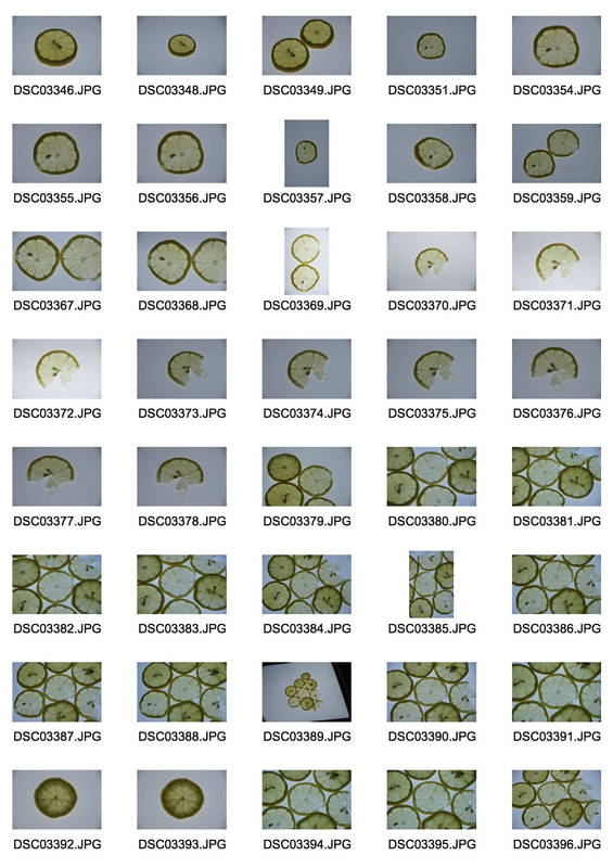
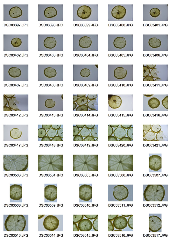
Lemons
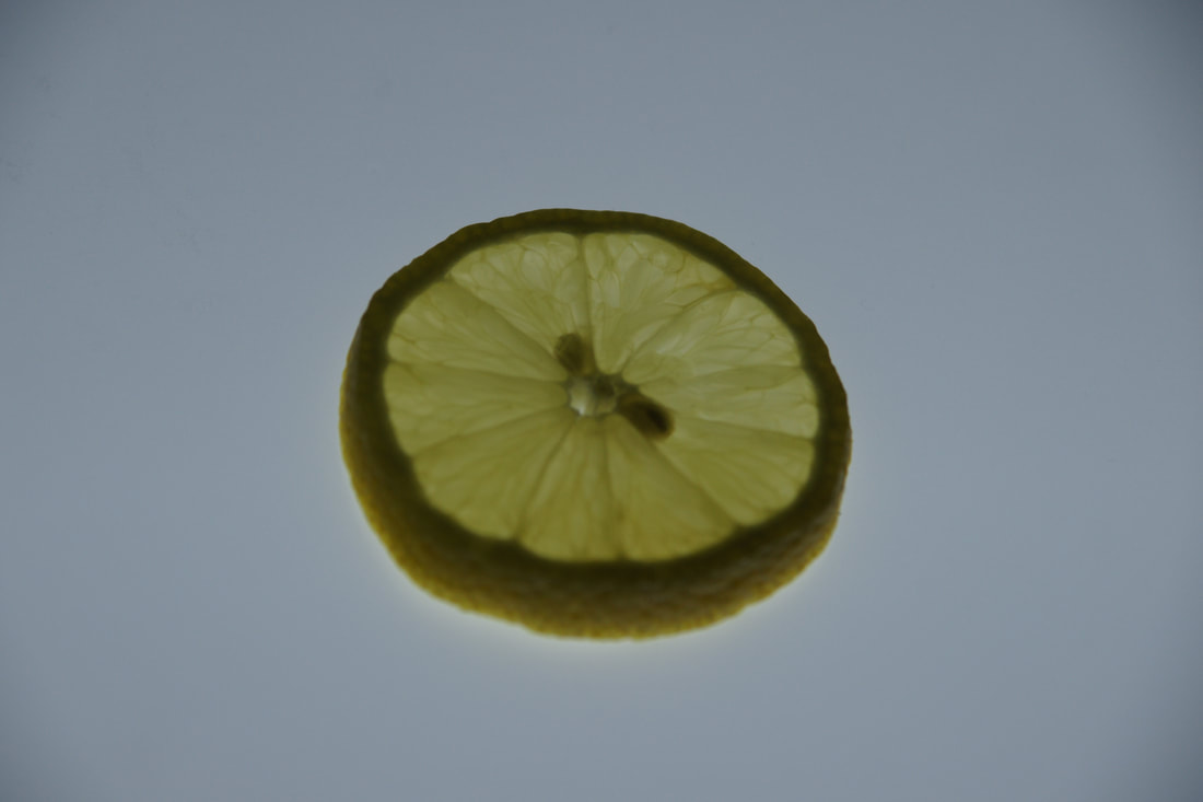
I found that the lemons were the hardest to photograph to the standard that I imagined, I feel this is because they are mellow and of a less vibrant colour compared to the other citrus fruits I have chosen. I believe they are less aesthetically pleasing in the photos I took and were a lot harder to work with.
|
|
|
Selects
|
Edits
|
|
|
|
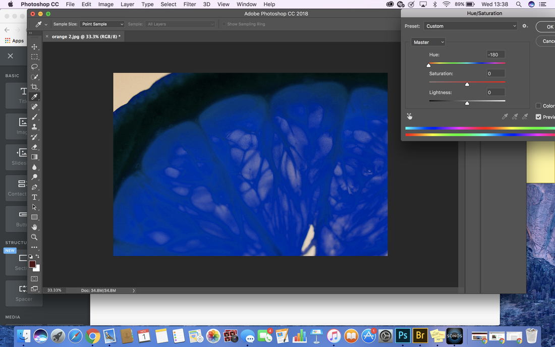
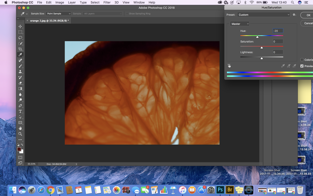
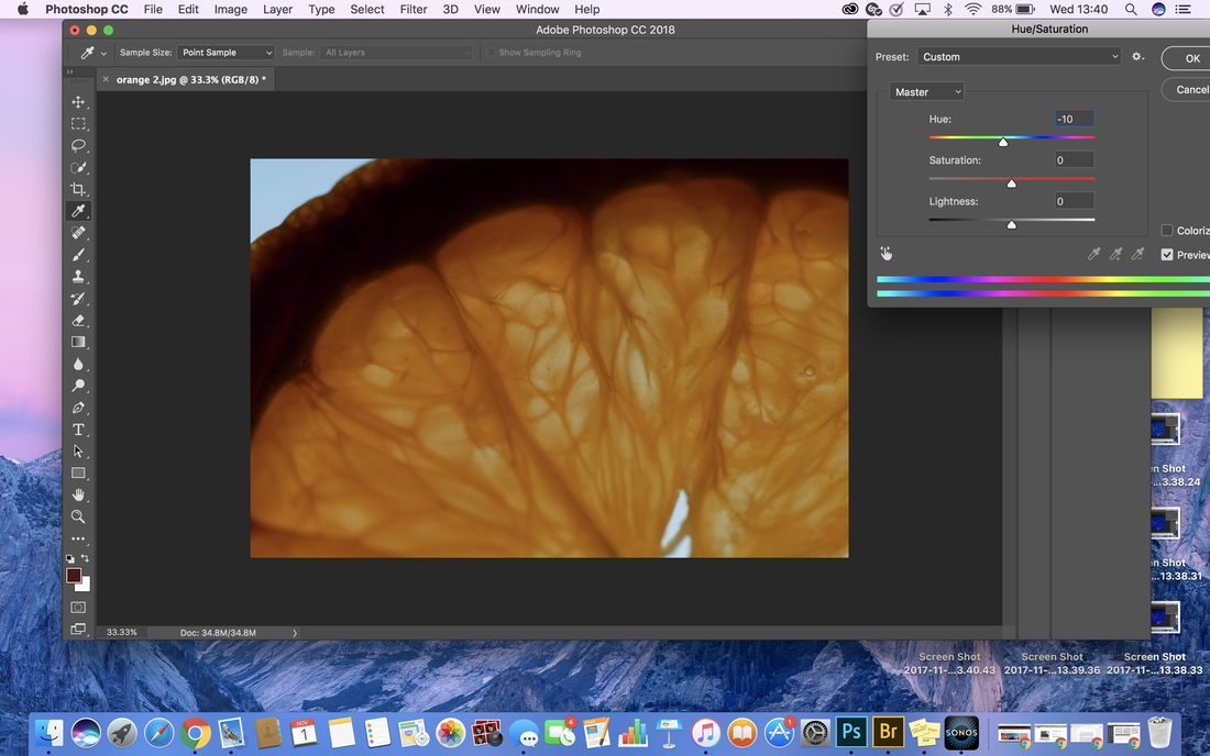
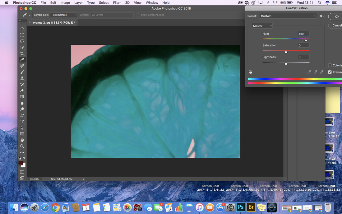
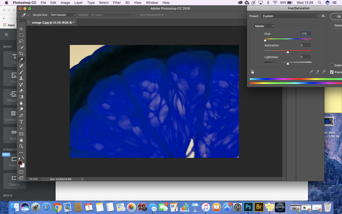
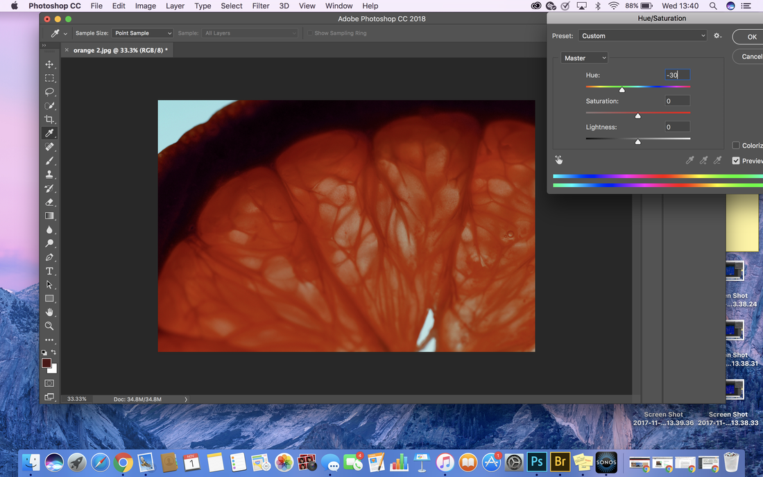
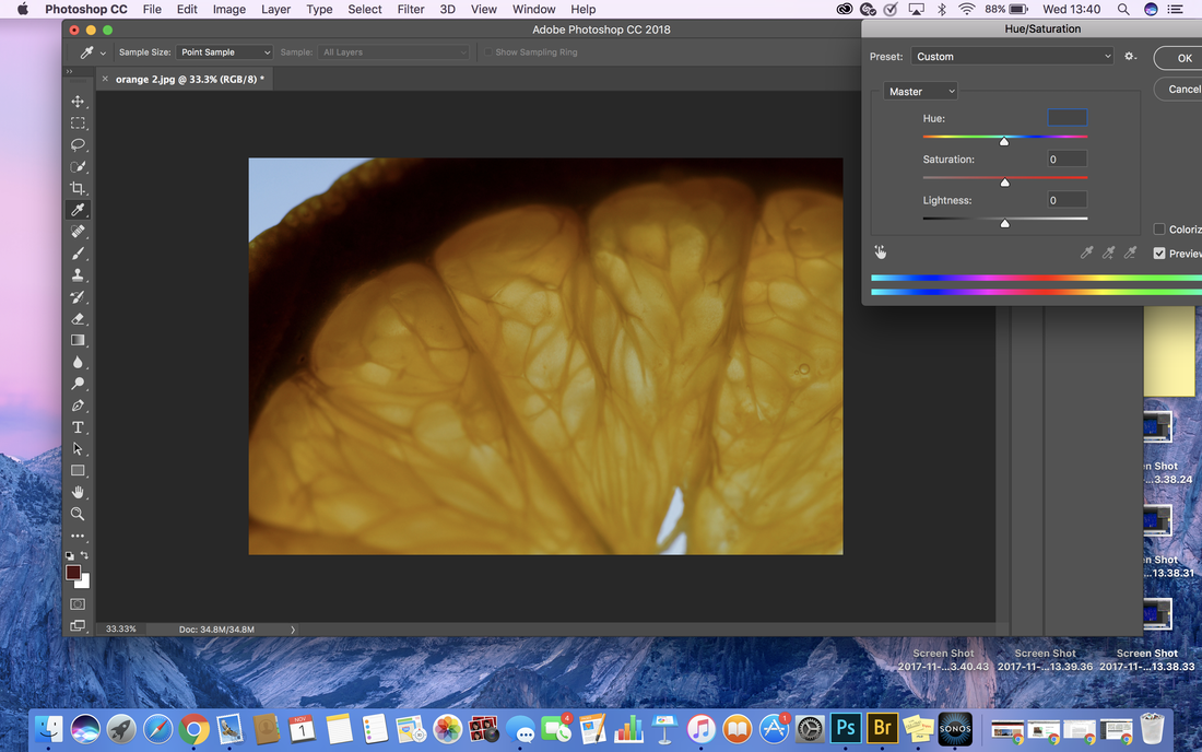
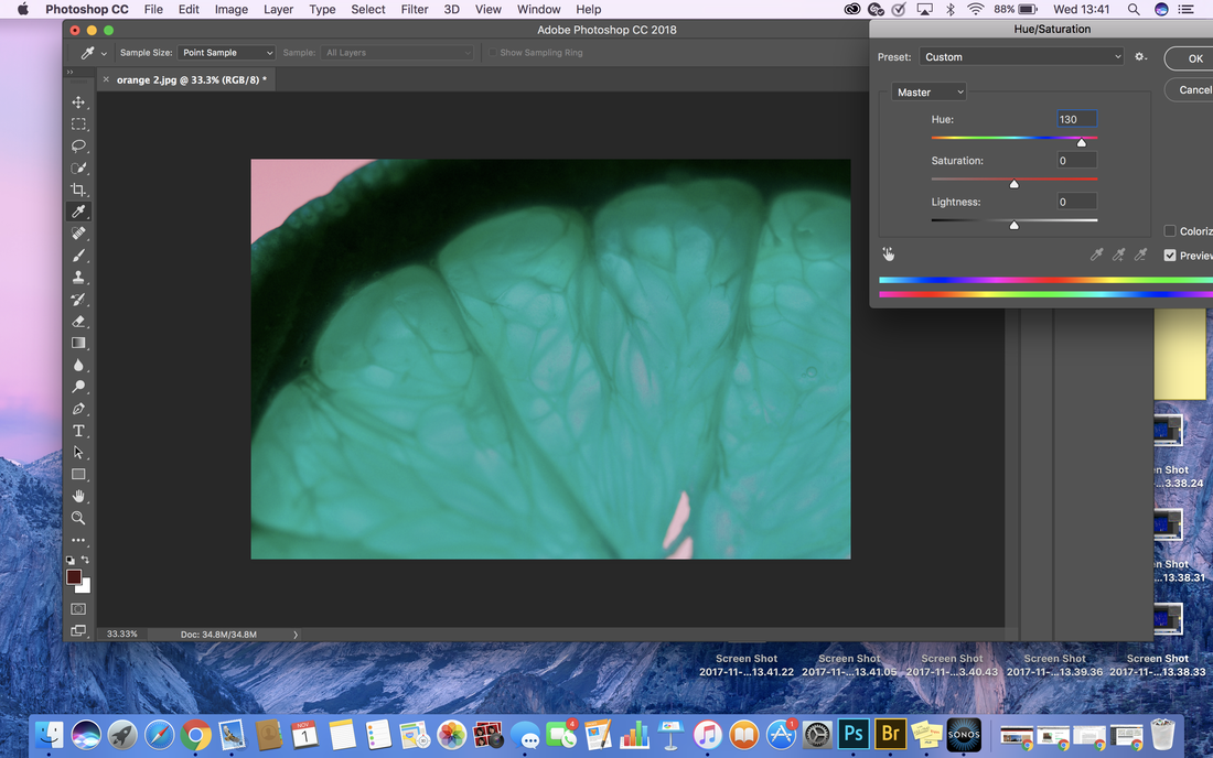
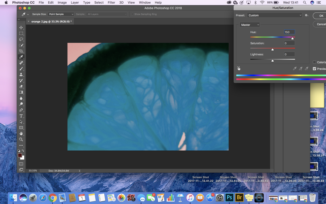
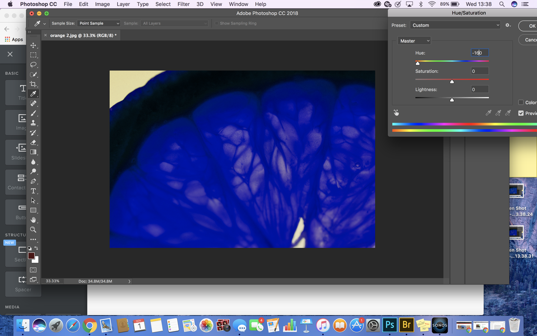
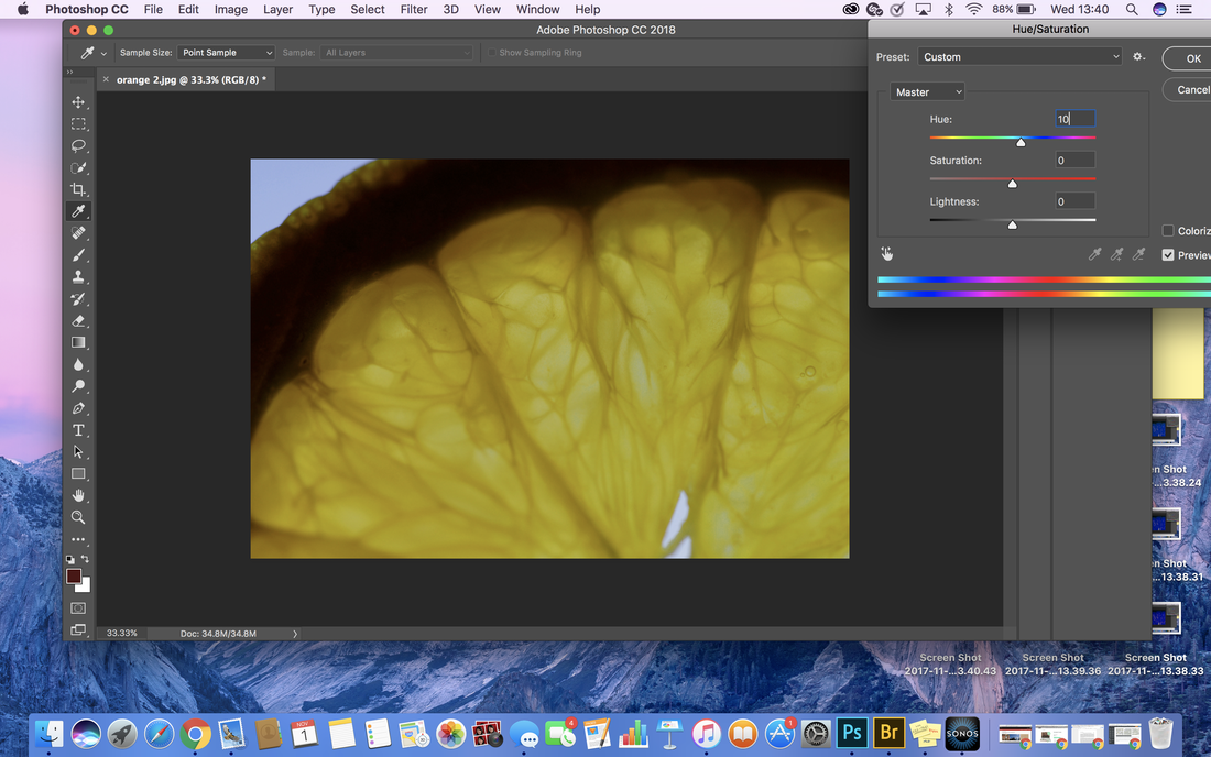
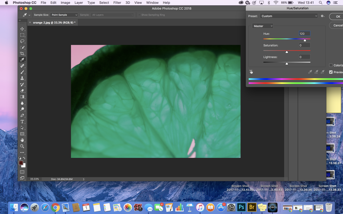
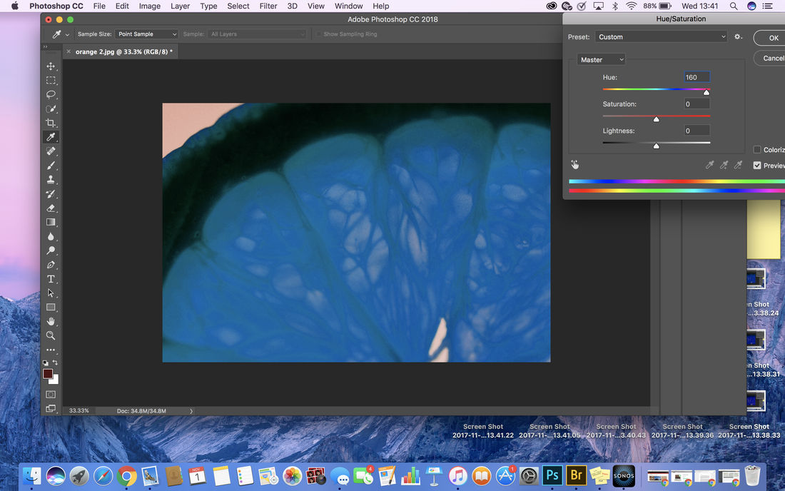
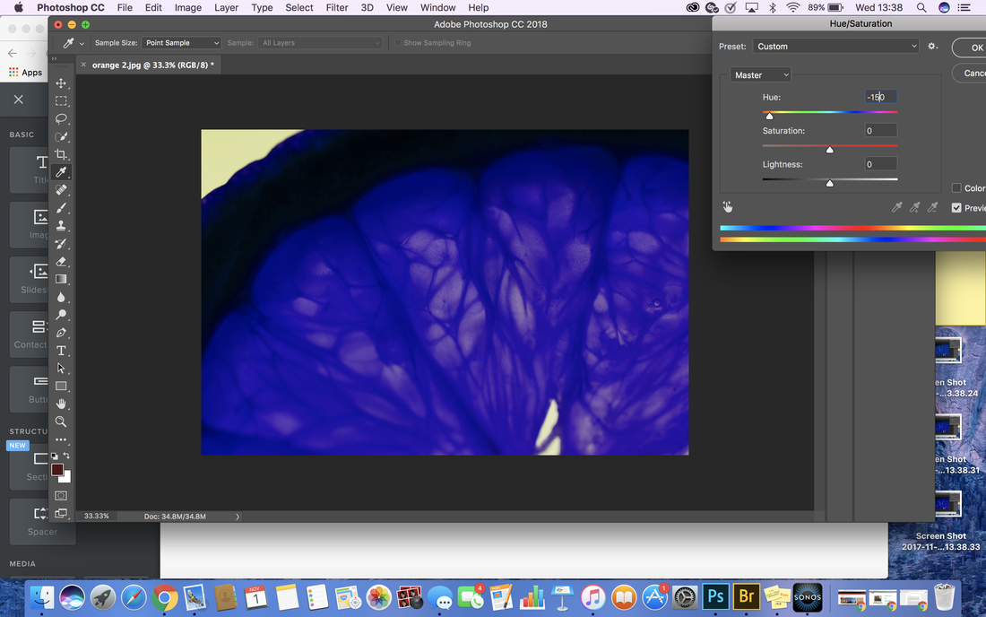
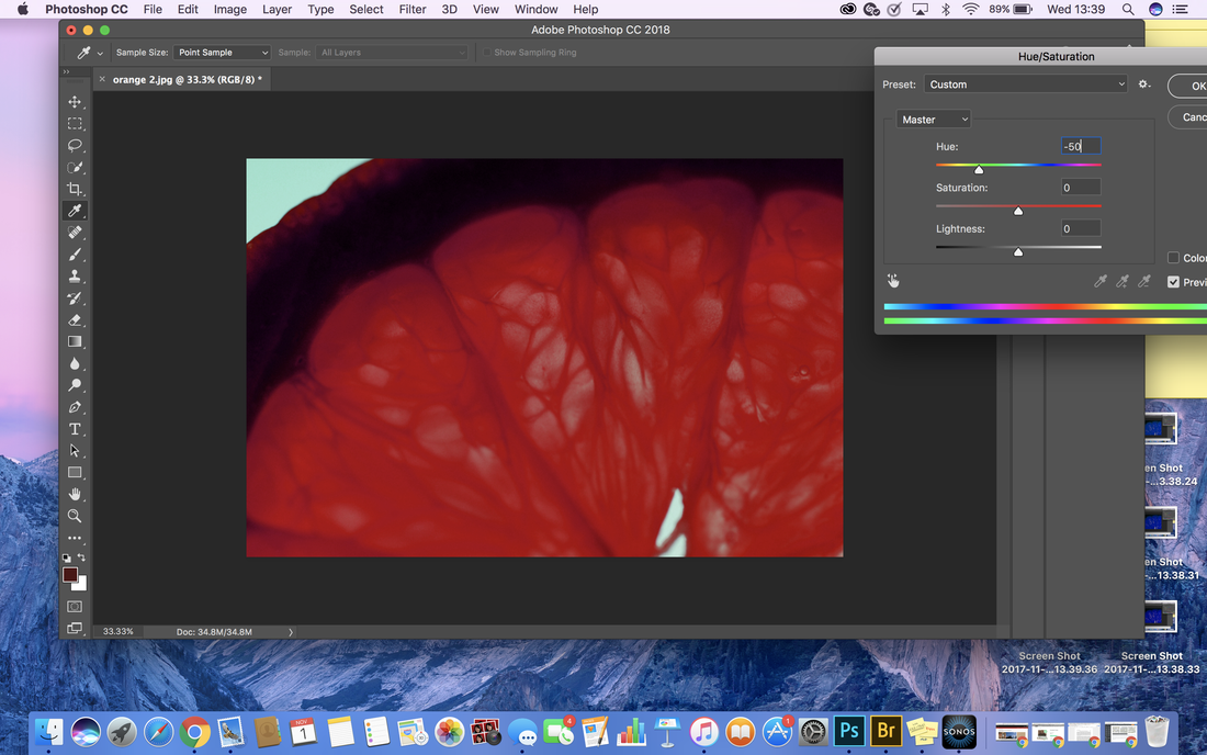
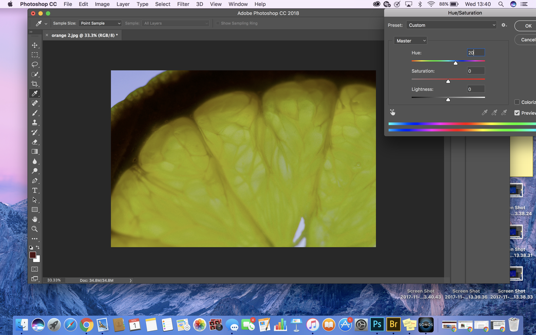
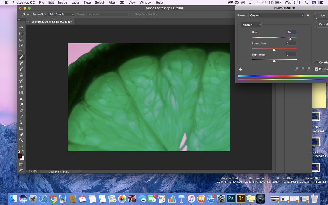
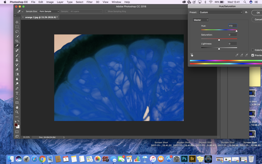
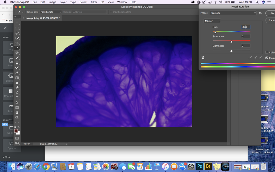
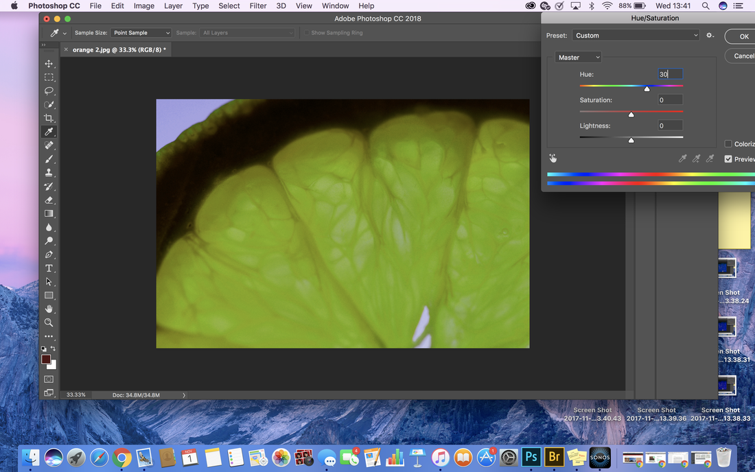
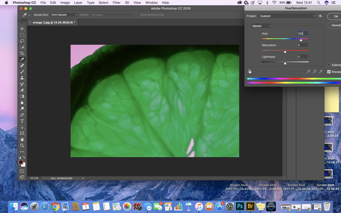
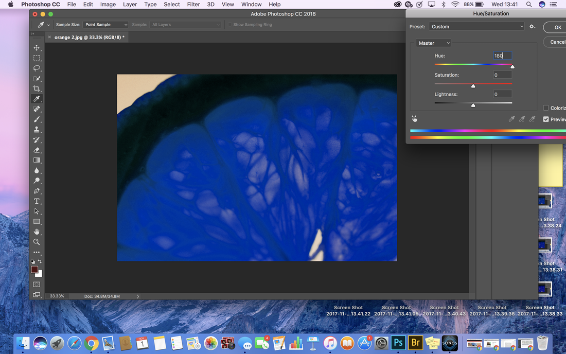
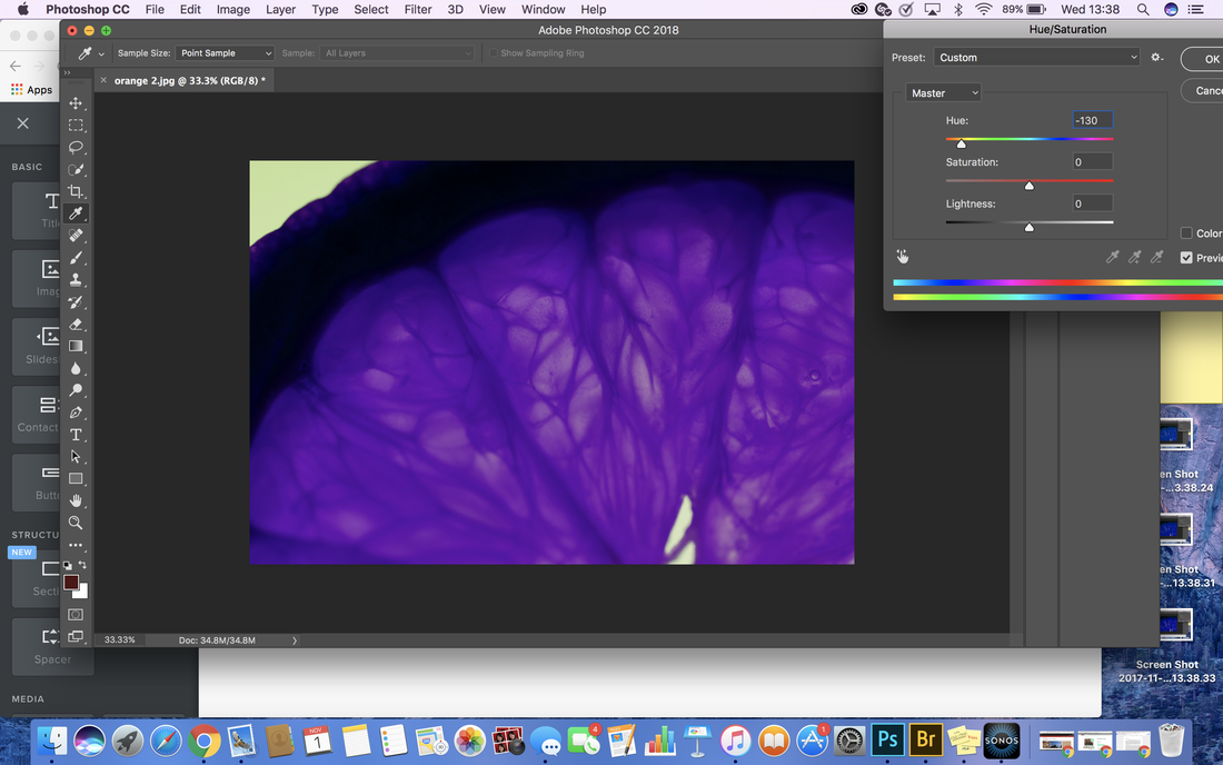
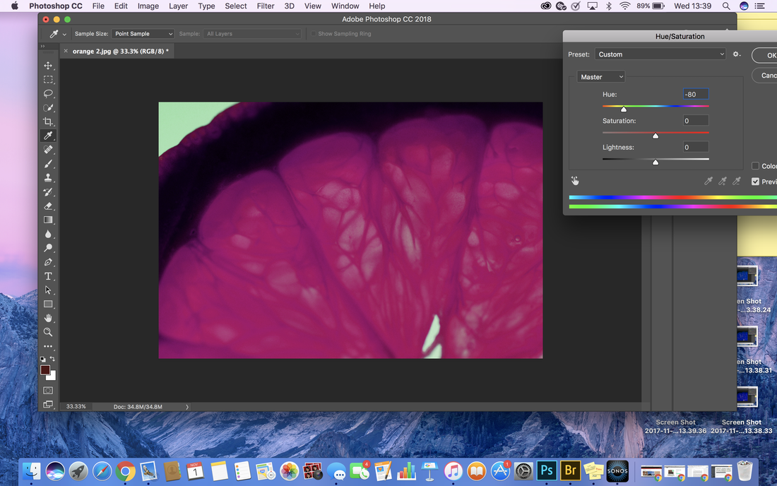
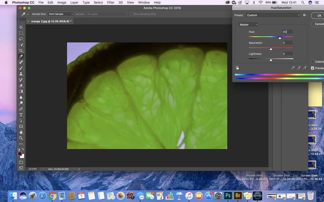
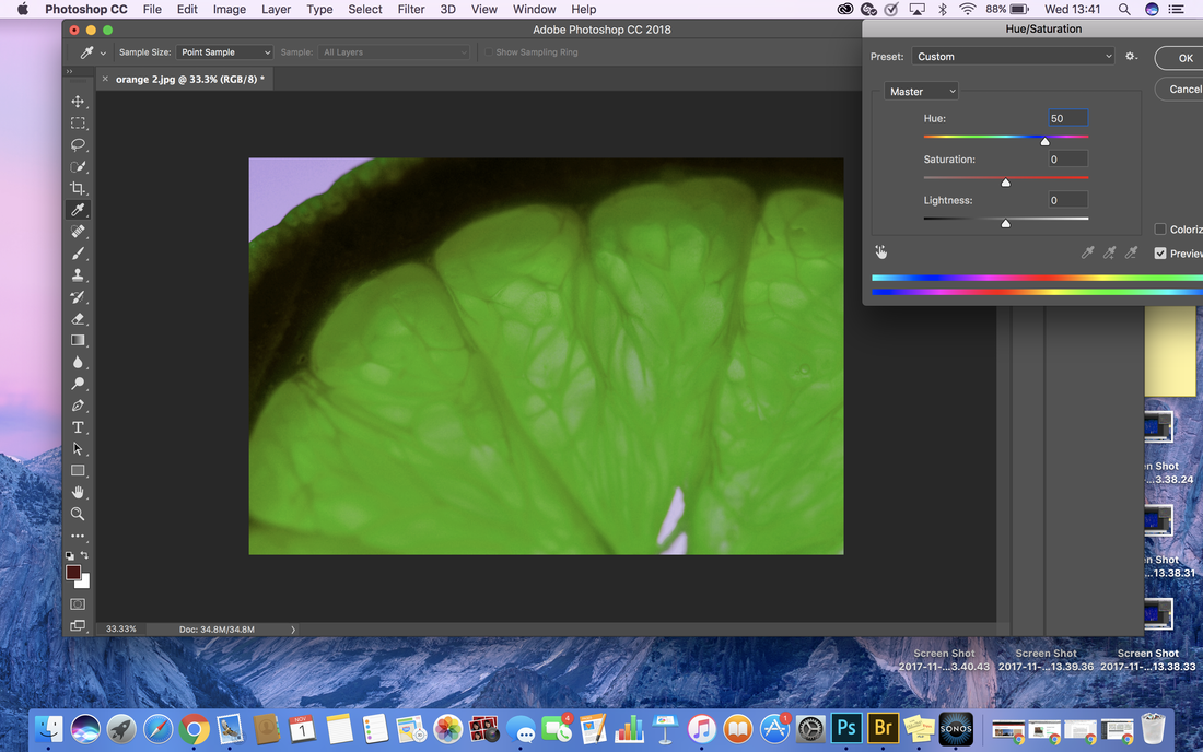
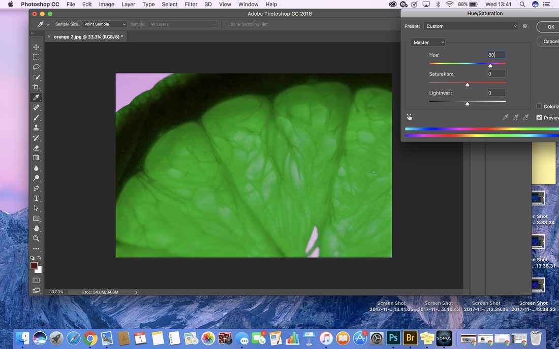
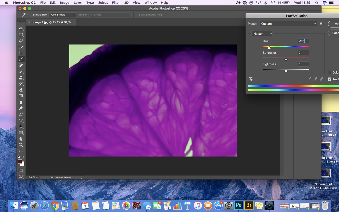
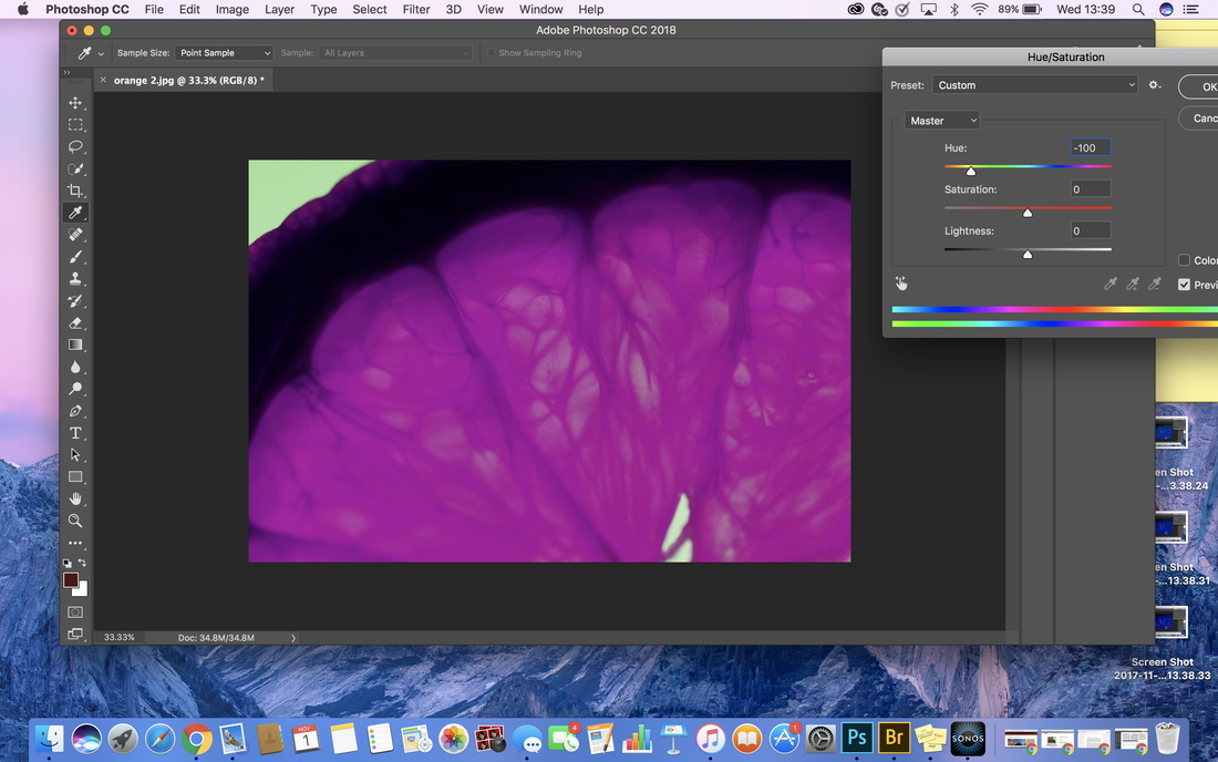
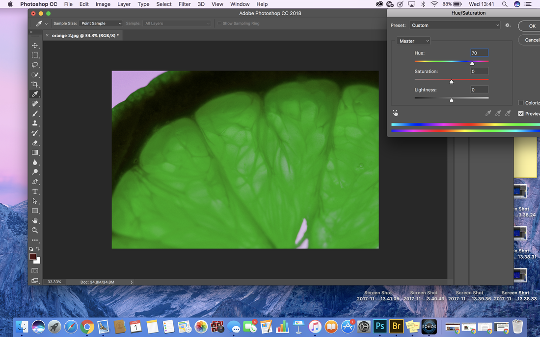
After finishing photographing all my citrus fruits I decided I wanted to experiment with other colours in fruits however, I was so set on using citrus fruits I decided to achieve this goal by using photoshop. I chose to edit a zoomed in picture of an orange as I felt it was the medium colour between all three of my fruits I photographed.
|
To change the hue of your photo, you have to: - drag your image into photoshop - open the image drop down box, go to adjustments and press hue/saturation - change the numbers in hue from -180 to 180 in small denominations |
|

|
|

|
|

|

|


|

|
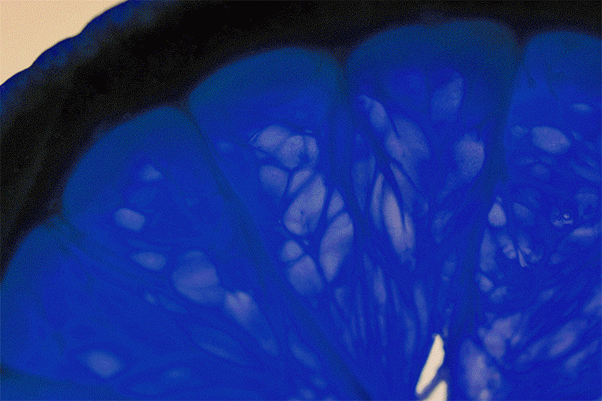
In order to showcase all the colours I experimented with I chose to create a gif showing the range, I believe this gif shows how vibrate the original picture was. Although not all the colours work well, I am glad I experimented in order to find this out.
|
To make a gif, you need to: - open photoshop - open the 'file' drop down box, open scripts and press 'load files into stack' - click on your images you would like to turn into a gif and press 'ok' 0nce all your images are loaded: - if 'timeline' is not showing, access it via the 'window' drop down bar - press 'make frames from layers' |
|
|
Then, I experimented using filters within photoshop. After a lengthy process of trying them all out I came to the conclusion that 'plastic wrap' was the most effective as it placed emphasis on the unique structure and made it look waxy. |
|
Strand 2: Portrait Structure
Jenny Saville
born 7 May 1970
born 7 May 1970
|
Jenny Saville is a contemporary British painter associated with the Young British artists. She is known for her large-scale painted depictions of nude women. At the end of Saville's postgraduate education, the leading British art collector, Charles Saatchi purchased her senior show. He offered the artist an 18-month contract, supporting her while she created new works to be exhibited in the Saatchi Gallery in London. The collection, Young British Artists III, exhibited in 1994 with Saville's self-portrait, Plan, as the signature piece. Saville currently works and lives in Oxford, England. |
|
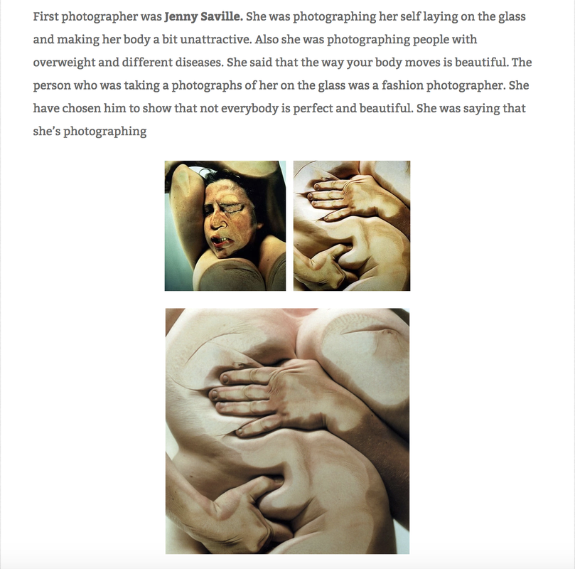
In this image you can see a woman pressed against a sheet of glass, so much so that her face and limbs have been distorted. The artist may have wanted us to consider the rawness of us as humans. This is shown by the body that has been stripped bare and manipulated. Moreover, they may have been addressing the issue of censorship and stigma concerning the raw body. Personally, I believe there is still a tremendous amount of stigma and a big taboo around the subject of bare bodies when every person has one. One of the few things that everyone has in common. The one thing that everyones uniqueness stems off of. The distortion of the face combined with the squished limbs creates a sense of discomfort suffering and pain. Furthermore, the distortion places emphasis on how the human body is easy to change and manipulate, so much so that some bodies can be made almost unrecognisable.
|
|
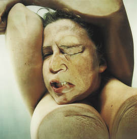
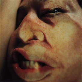
In these photos you can see a woman's face pressed against a sheet of glass. These images are more focused on a single element rather than the whole body. This generates a whole new perspective and helps the observer focus on more refined components of the photo. The colours caused when pressure is applied to the face whilst pressed against glass mimics that of bruises or friction. Some could argue that this is the artist addressing issues concerning manipulation and abuse, although this is a weak link many people asked thought that the photo had been manipulated to replicate the colours when abused. The artist may have wanted us to consider the changes we can make on our own bodies. I think in the present day women specifically are just coming out to say the abuse they have received. This is why I think this is such a relevant series of work, as its connotations and ideas that follow are fundamental.
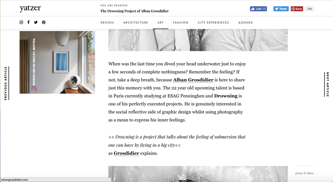
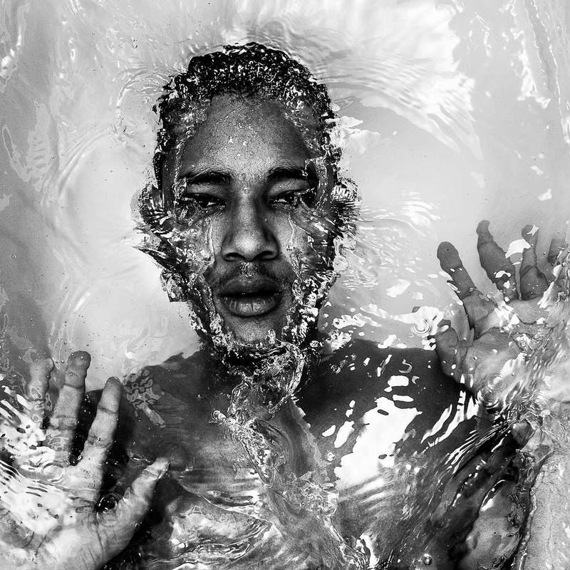
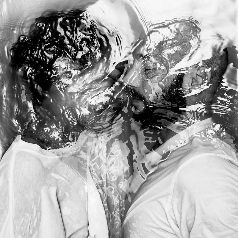
Adam Grosdidier
Alban Grosdidier is a French photographer born in 1989, living between London and Paris. He started his professional career in photography by collaborating to the editorial team of French anti-HIV festival Solidays in 2010; until 2013, he focused on HIV-focused movements, LGBTI groups, feminist activists and the event landscape in Paris. In 2012, his portrait series Drowning - a visual comment on big city life - and the subsequent street exhibitions in Paris became his first internationally recognised series. Graduating from ESAG Penninghen in 2013, he moved to Copenhagen where he started a collaboration with Greenpeace; he has since covered the organisation’s activities in Denmark, Sweden, Russia, France and the UK. Moving again in 2016 - to London - he is now covering British movements including anti-Trump / anti-Brexit groups, anti-fracking camps and alternative accommodation networks. Early 2017, he joined the French photojournalism collective Hans Lucas. His client list includes Greenpeace, Oxfam, [PIAS] Recordings and Solidays, and his work was published in various papers including Le Monde, Libération, Les Inrocks, Le Point, L'Express, The Murmur and Digital Photography Russia.
In the whole of this series the photographer may be considering each individual persons personal experience with water. This experience plays a part in how they interpret this series.
Personally, I think the whole of Adam Grosdidier's 'drowning' series is inspiring and raises so many ideas. Most people would not be able to say how it feels to be drowning. I believe that this series creates a sense of innocence in drowning, picturing it as peaceful.
Personally, I think the whole of Adam Grosdidier's 'drowning' series is inspiring and raises so many ideas. Most people would not be able to say how it feels to be drowning. I believe that this series creates a sense of innocence in drowning, picturing it as peaceful.
In this photo you can see a man with his hands pressed against the surface of the water. This implies a sense of struggle even though he is completely free and looks calm. All his facial features have broken through the surface of the water and have only left his body submerged. This sparks the idea of floating and being at inner peace when you pass. The contrast between the clearness of the water and the subjects skin creates an aesthetically pleasing frame and showcases the beauty of the natural body. The artist may have wanted us to consider the link between a body of water and the human body as they play well together and compliment each other in ways other elements can't. The features of the subjects face look free from natural imperfections producing and promoting a pure and sinless atmosphere. One that could then be reflected in a viewer.
|
The combination of different people in the water together sparks different ideas about what the artist may be addressing. In my personal opinion, when I see the image of the woman and man in the water it makes me think of love. I thought about this because when I first looked at the image the identities of the subjects were hard to determine and I thought it was two men and I loved how love was being professed and represented in a more vast way compared to in the past. Once coming to the realisation it was a man and a woman it made me think about life after death as well as marriage. When people get married they say vows which normally include "till death do us apart". This is what I thought of when I saw this image as it seems as though they are passing away centimetres apart from each other, thus professing eternal love.
|
Similarly to the fist image, you can see a woman who is submerged in water. The woman's hands are up in a defending position however, they are not nor trying to penetrate the surface of the water. This could symbolise how the innocence has not been broken. The innocence being the perfection of the un-broken water surface. There is a sense of serenity in the fact that the woman isn't even trying to escape the body of water. Ripples of water around the woman's mouth can be seen which could suggest her taking or attempting to take her last breathe. This idea could be what the artist it wanting us to consider. The idea that once you've taken your last breathe and there is nothing else you can do, you have a sense of peace and tranquility, knowing that you did everything you could and you can't do anything more to save yourself.
|
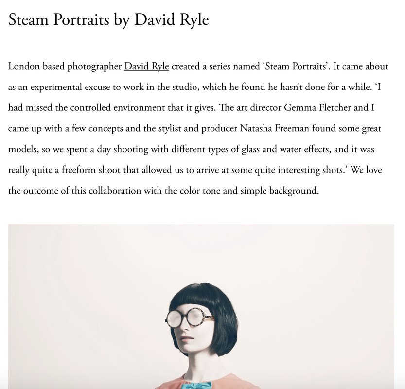
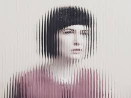
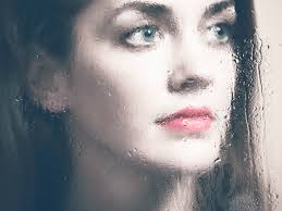
David Ryle
|
David Ryle is an internationally renowned photographer based in London. He has shot editorial for the likes of The Sunday Times Magazine and Wink Creative and advertising for JWT, Saatchi & Saatchi, and AMV BBDO. His work has been in numerous awards including: IPA, AOP & Campaigns Big Awards and has exhibited at the Royal Academy. He’s represented in Europe and the USA by The Peter Bailey Company. |
|
This series of 'steam portraits' could reflect the anonymity of a person. The fact that their face is hidden behind materials to conceal them and their emotions. This is also reflected in the fact that all the subjects are seen looking into the distance aimlessly.
|
|
|
In all three of these images an anonymous female can be seen. In each of these a different element or material has been used to obscure and distort the face and facial features. The artist uses different types of patterned glass in front of the subject in order to create a different type of distortion each time. The idea of 'steam' is shown in many images, a lot of these containing glass elements like glasses to show the steam in the room without making in a main component to focus on. The sense of anonymity creates an impression of the unknown and makes a clearer image more impactful. Moreover, the fact that all three images of these women are of them gazing into the distance imply a sense of confusion and may be addressing a bigger issue. It could be argued that the idea of women staring into the distance reflects them as hollow and useless. This is a pre-historic stereotypical idea of a woman can be seen in many artists works when they are trying to express gender stereotypes.
My approach to Portrait Structure
I chose portrait structure as my second strand because I was inspired by the structure and composition of us as humans and how that composition could be manipulated. I experimented a lot with different angles and components in my photos. Along the way I worked out the best lighting, position and components in order to obtain the best representation of what I envisioned prior.
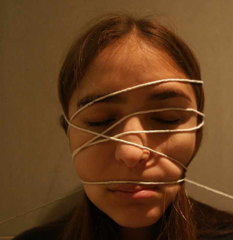
|
I experimented with glass in order to distort the face, this inspiration was from Jenny Saville. Then I experimented with string. This was harder to complete as the string kept moving and I found it hard to maintain its position for long enough in order to take a photo. Finally I chose to combine both my experimenting factors in the ultimate experiment. I thought that if I added a distracting component to the glass, it would create a whole new perspective and would allow me to see how it would further distort the face. |
|
|
Distorted by glass
Distorting my subject by glass was my main objective, this is the one that I spent most of my time shooting. If I were to develop this further I would thoroughly consider the time of day at which I complete it as this effects the amount of natural light available. As I am using glass between my lens and my subject, I could not use flash as it would reflect and not allow my subject to be seen properly. As it can be seen in my contact sheet, I was not able to achieve the best lighting. I will show the difference between my selects and edits in order to show my process of achieving the best image via altering the levels
|
|
|
Selects
|
Edits
|
|
Distorted by string
Distorting my subject by string was an experiment which I decided to pursue once photographing my distortion by glass. If I were to develop this further I would thoroughly consider the time of day at which I complete it as this effects the amount of natural light available. The use of string was a major hurdle I had to cross as it kept slipping, this happened so quickly that it didn't allow me to take a picture in time. This is why there is such little selection of images. Moreover, from this selection I decided to only choose one to edit. I am glad I experimented with string as I helped me solidify how I wanted my final pictures to look. As it can be seen in my contact sheet, I was not able to achieve the best lighting. I will show the difference between my selects and edits in order to show my process of achieving the best image via altering the levels
|
|
|
Select
|
Edit
|
|
Distorted by glass and string
Distorting my subject by both string and glass gives an observer more to look at as well as creating a whole new perspective. This was by far the hardest to shoot as the string position was hard to maintain and the glass was highly reflective, this paired with the lighting made it hard to capture. As it can be seen in my contact sheet, I was not able to achieve the best lighting. I will show the difference between my selects and edits in order to show my process of achieving the best image via altering the levels
|
|
|
Selects
|
Edits
|
My Favourite Strand
The strand I decided would be best to develop was 'Organic Structure'. This was the strand that interested me the most as I had lots of different ways I wanted to develop it. During my first development of my strand I made the link between human anatomy and the fruit I chose, this is something I would like to experiment with. As well as this, I intend to look at the flesh of my original fruit underneath a microscope to fully understand the microscopic structure, that cannot be seen with the naked eye. Moreover, my next development will be inspired by Ajay Malghan and his bleaching series, this is an experiment and I am excited to see how it could turn out.
Bleaching
|
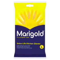
Inspired by Ajay Malghan I decided to pursue a further development of bleaching. As I completed this development I came across a number of issues. I chose to print out my original photos on photo paper of fruit and place them in a pool of bleach. I used marigold gloves to place the photo in the thin bleach. One of the issues was the rate at which the ink faded. This meant that I ended up liking my pictures documenting the process more, rather than the outcome. If I were to re-do this in search of a better outcome, I would try and bleach the fruit instead of the photos, as I believe thats where all my issues stemmed from.
|
|
|
Overall, I am not at all happy with my images and are displaying them as a learning curve for me. In the future, this will show what I shouldn't do. Although I am not satisfied with the outcome, it helped me think of other ways to develop this strand.
|
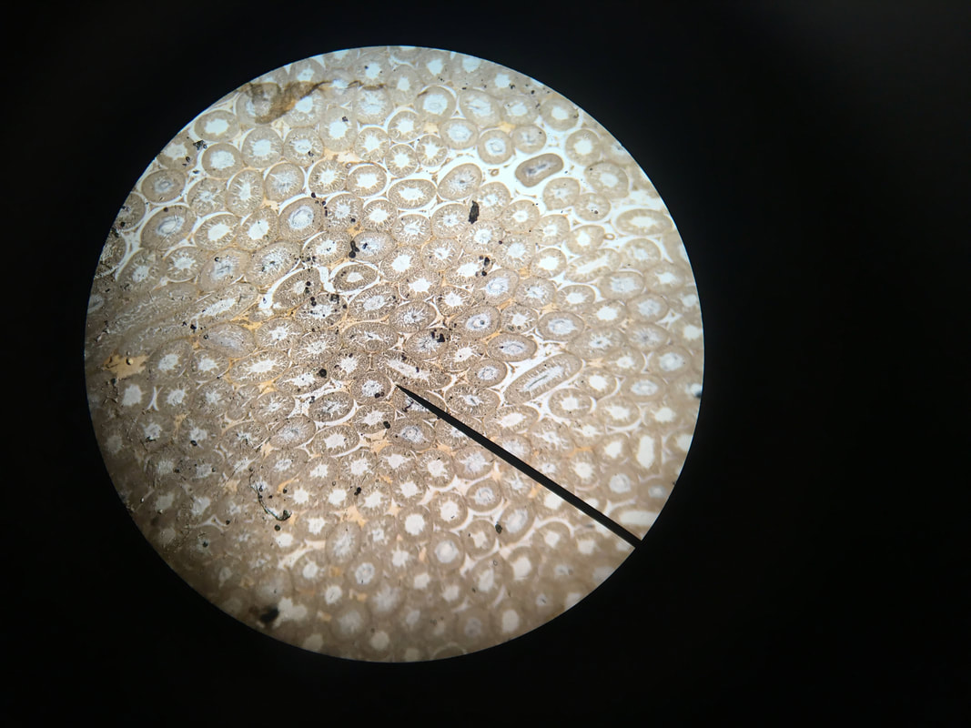
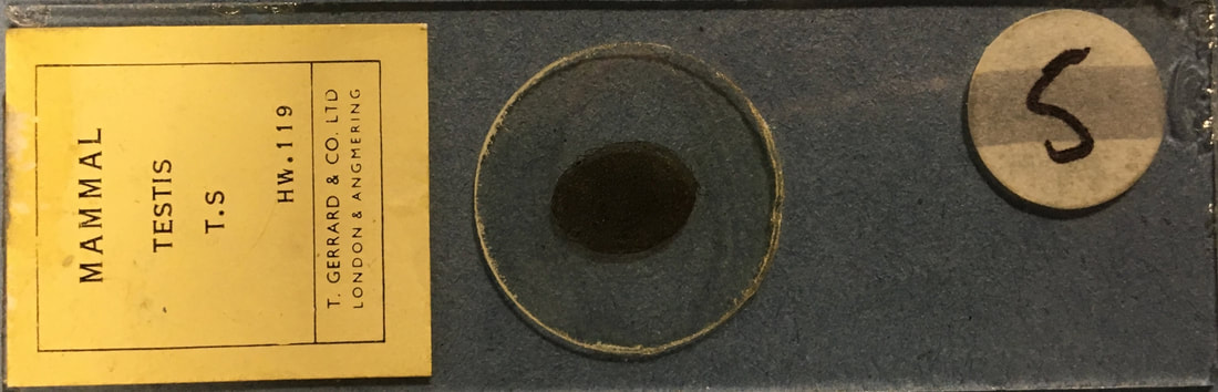
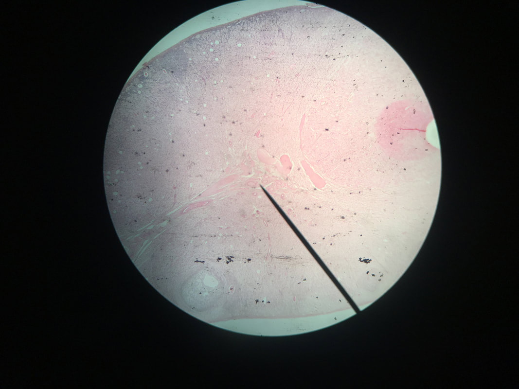
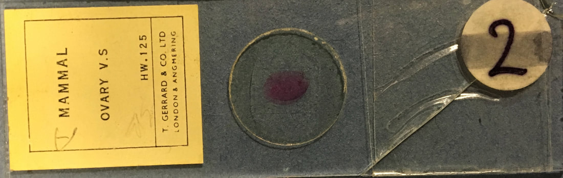
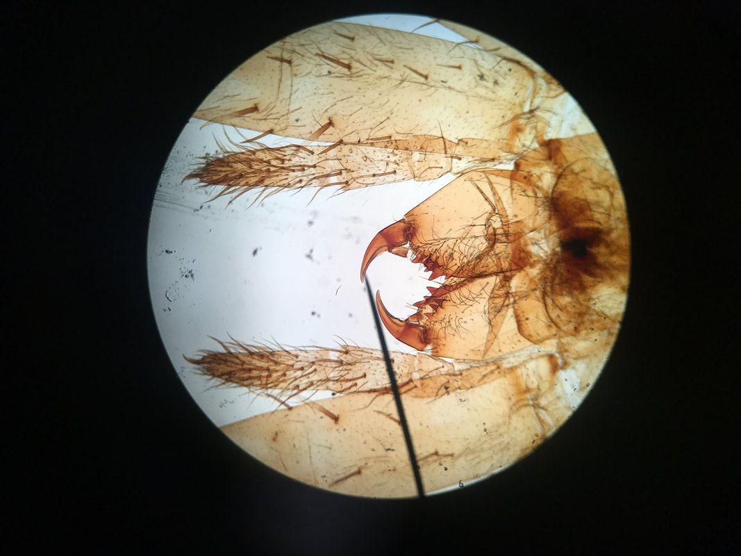
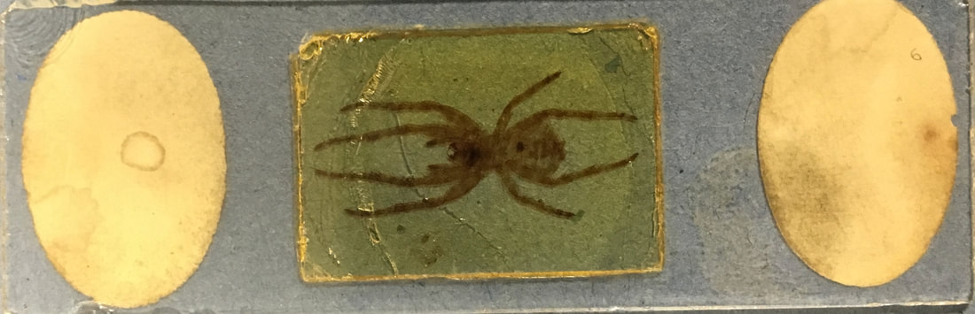
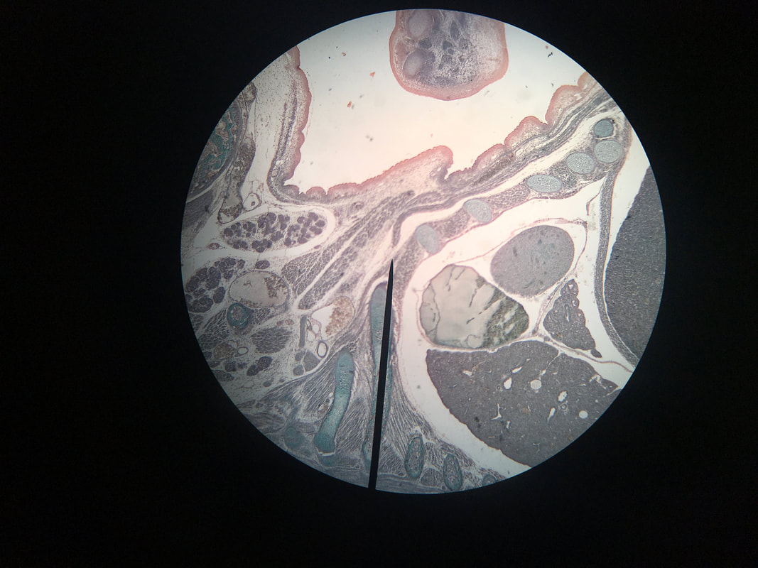
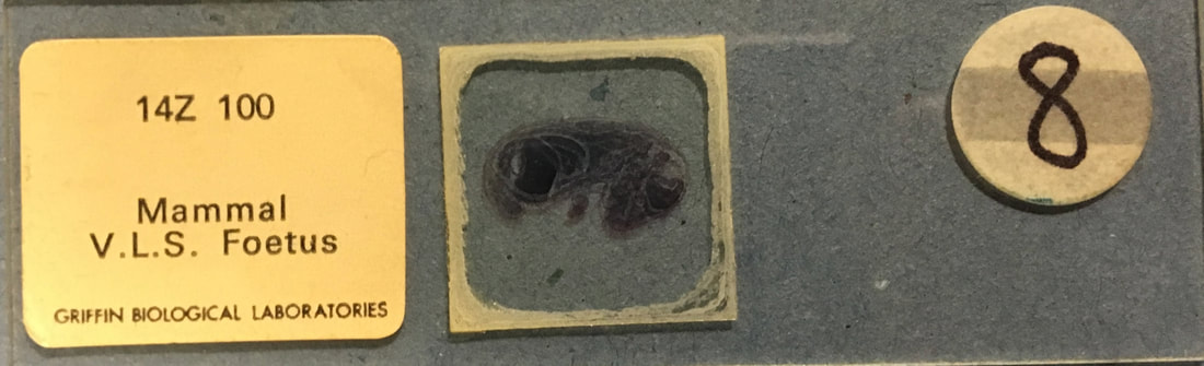
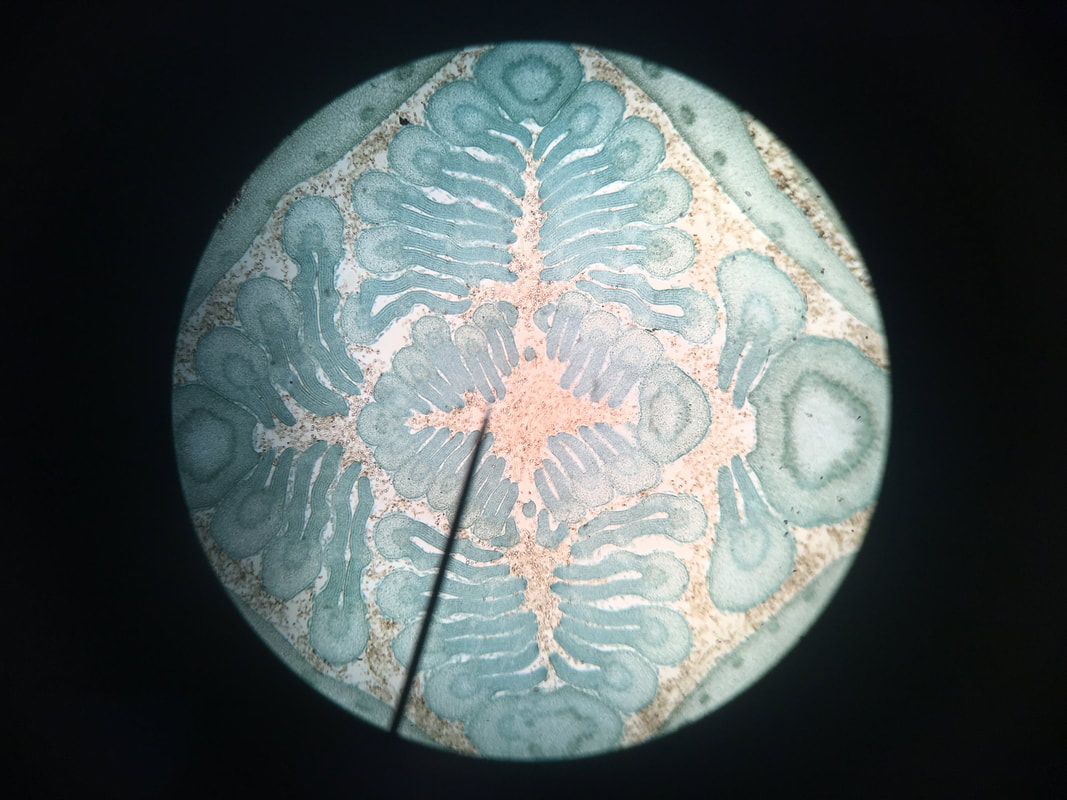
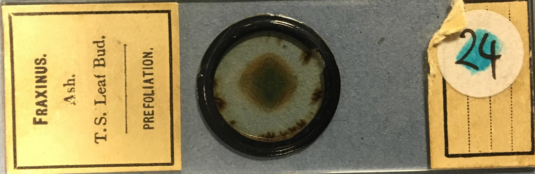
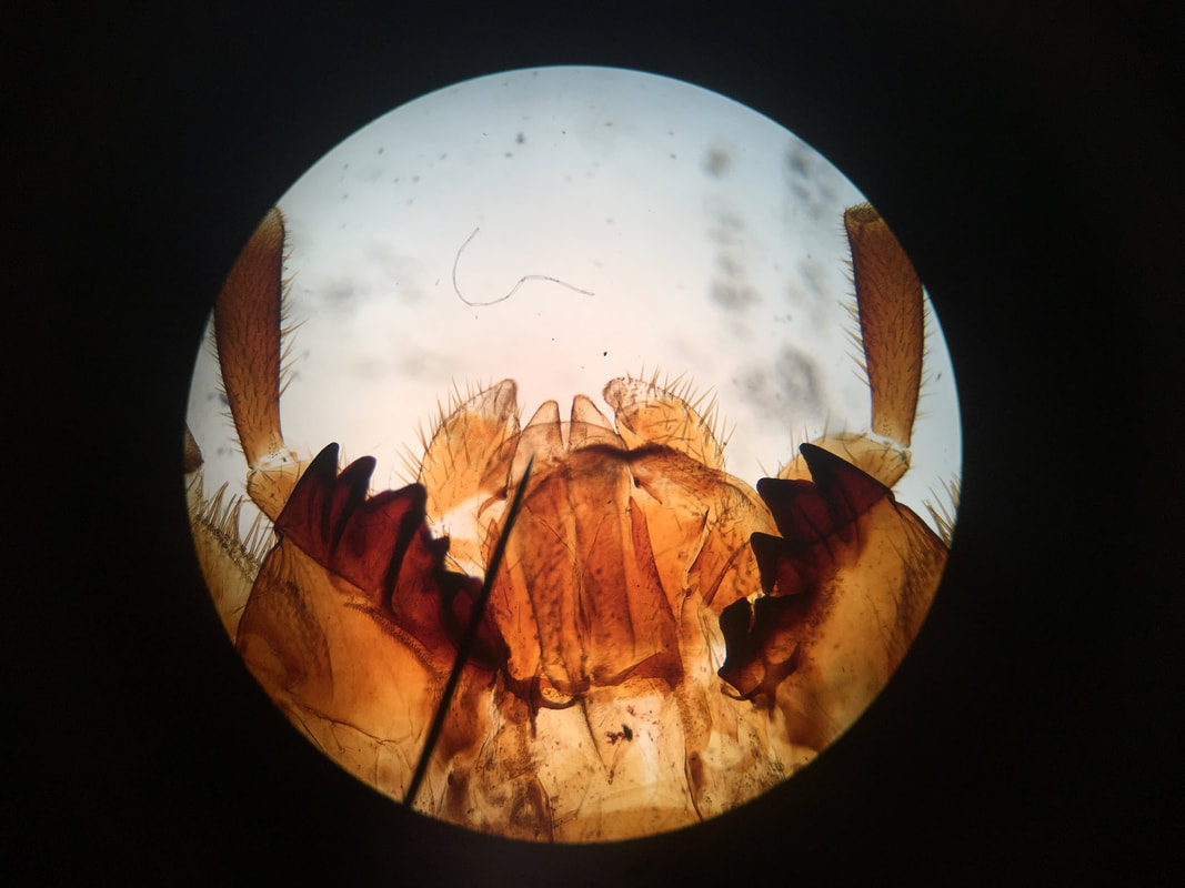
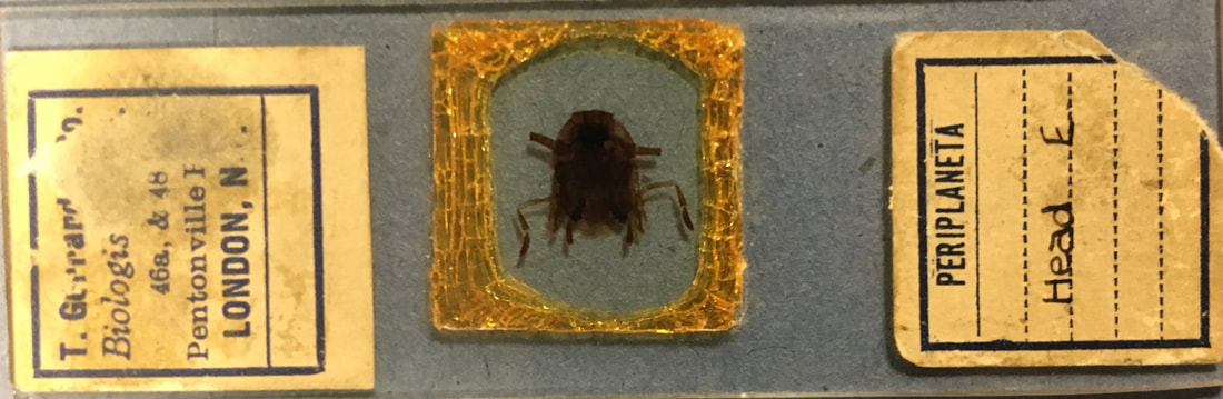
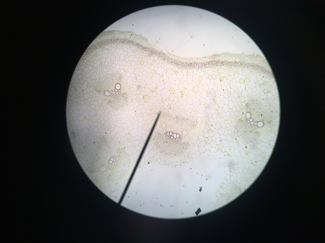
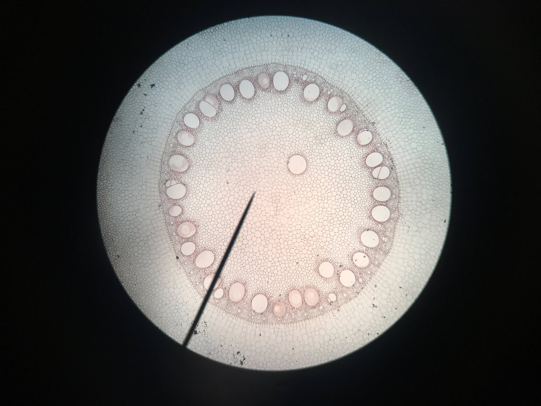
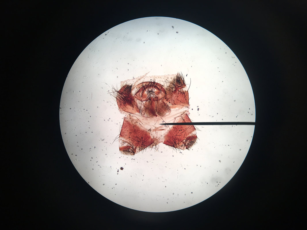
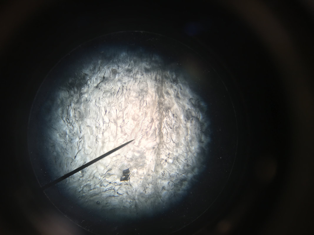
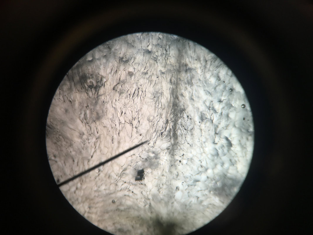
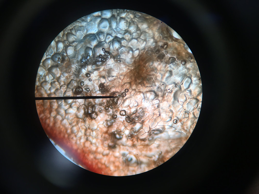
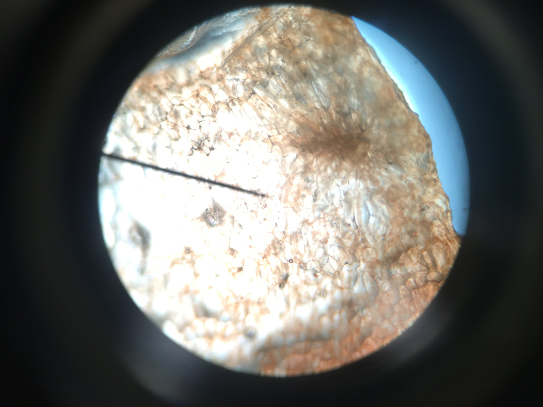
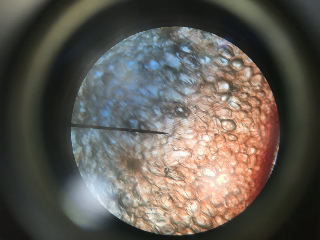
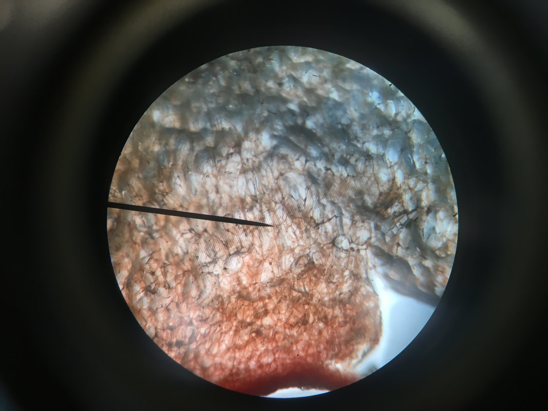
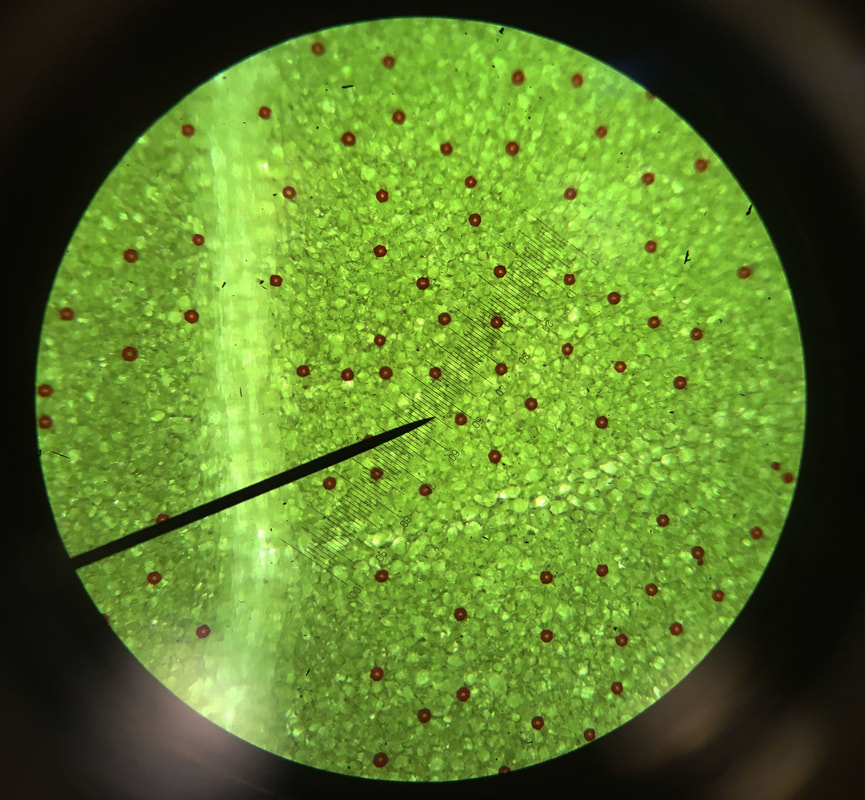
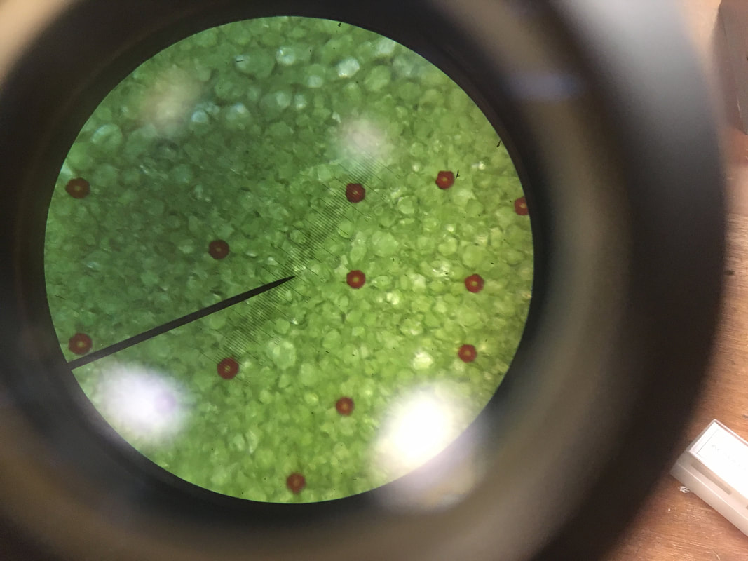
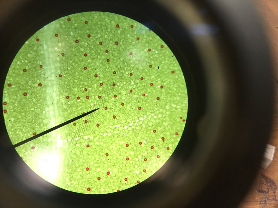
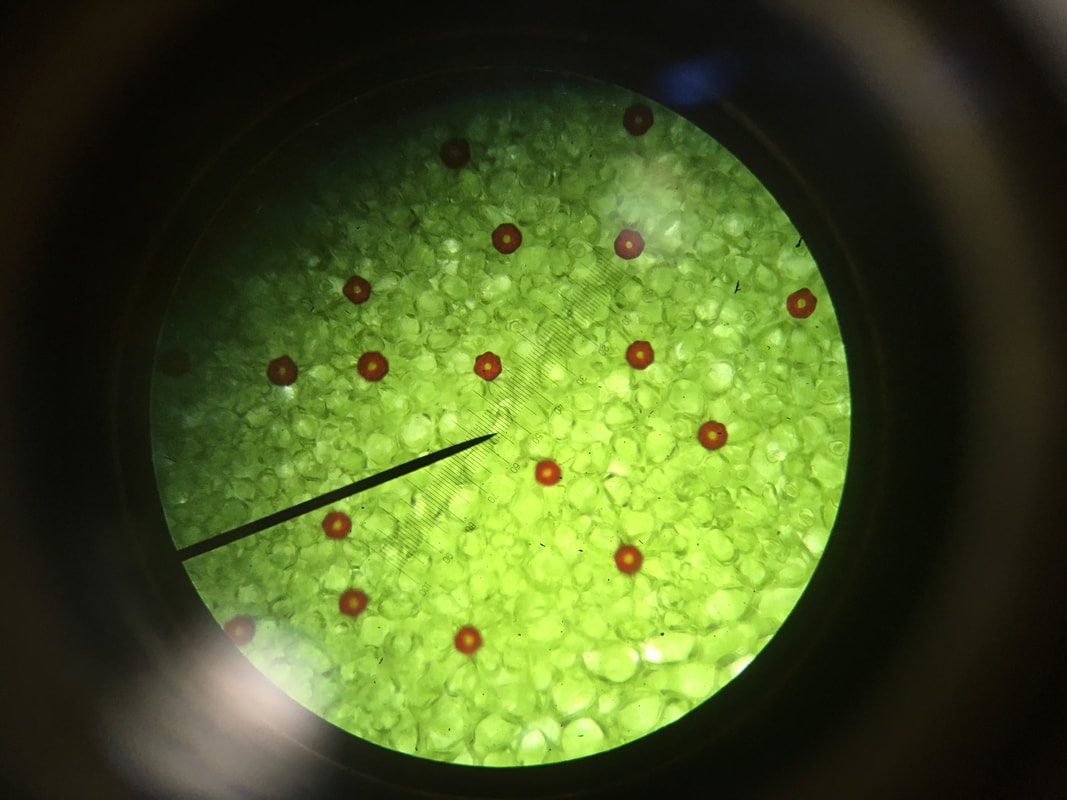
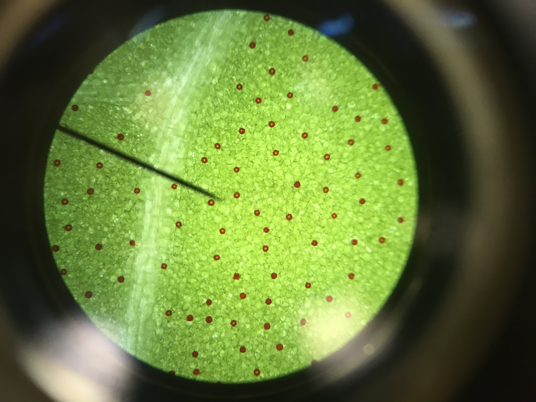
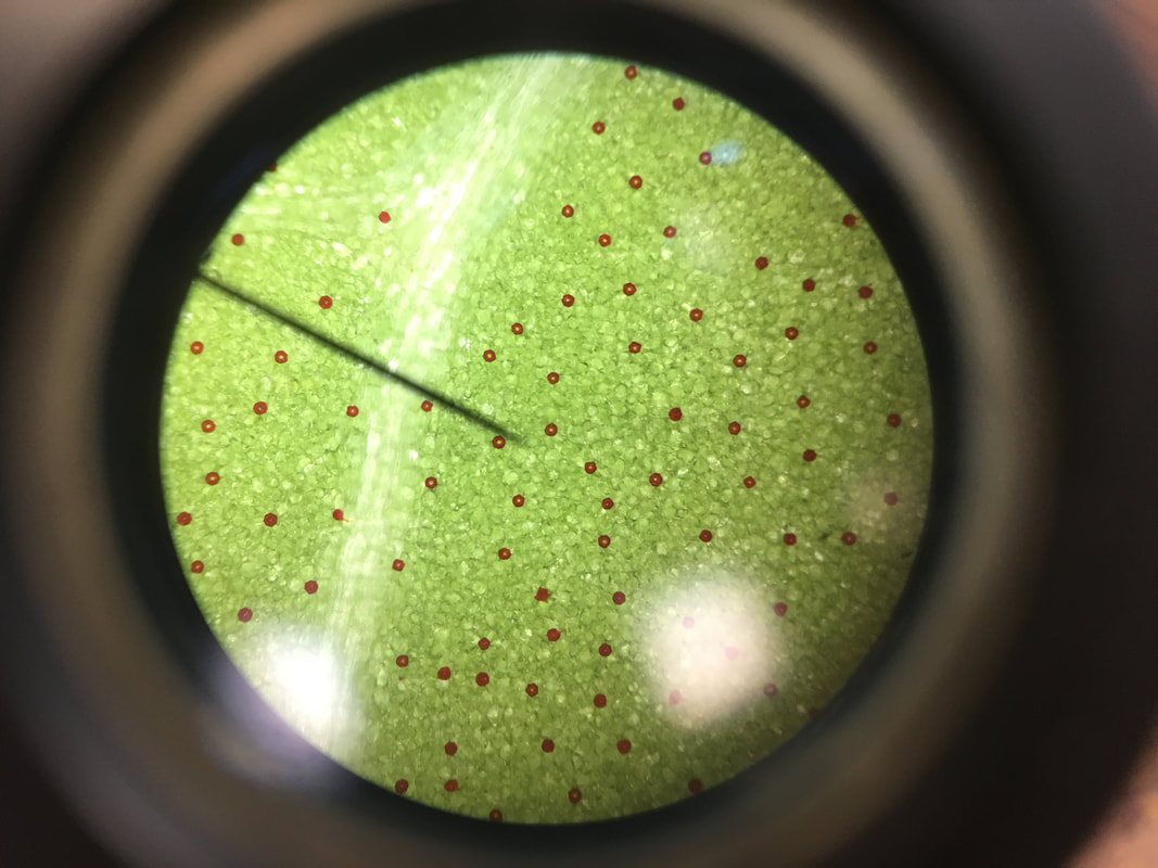
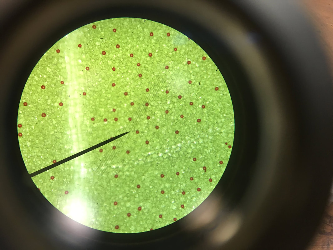
After pursuing this development I decided that it was not one I would want to work on further. Now, I have decided I would rather look at the fruit under the microscope as it will let me see the structure that can not be seen with the naked eye.
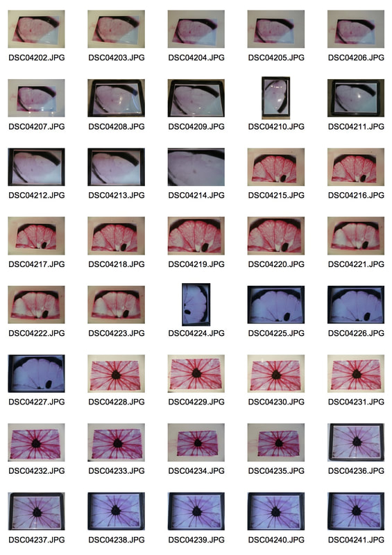
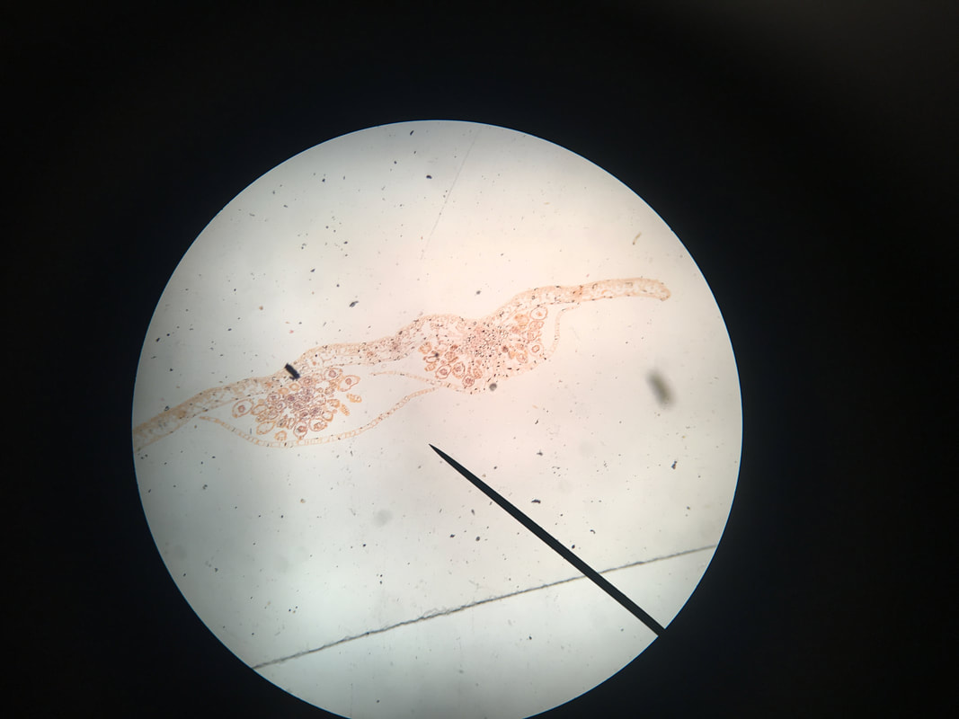
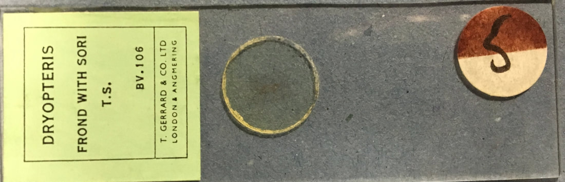
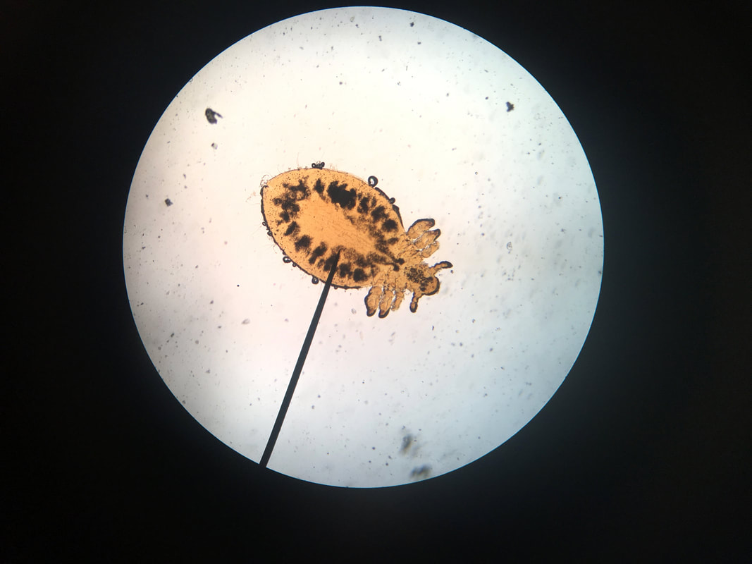
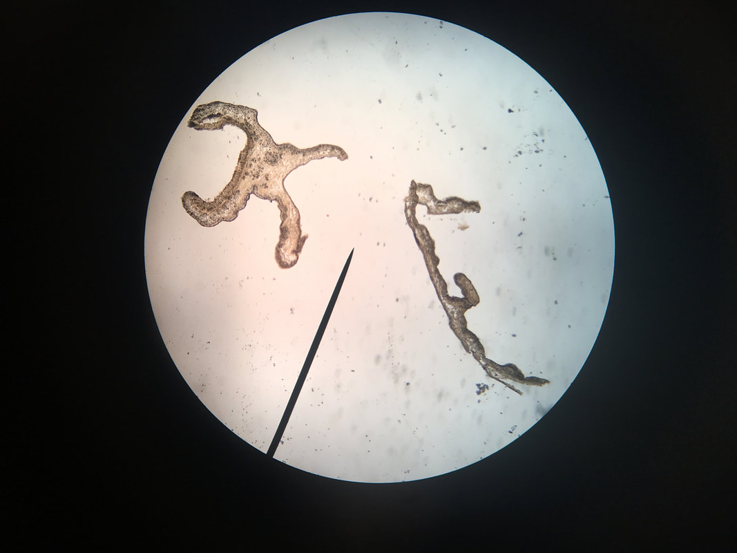
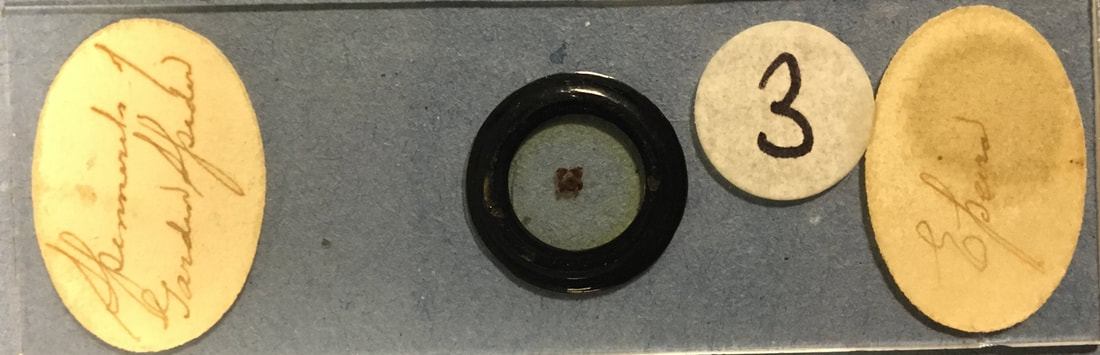
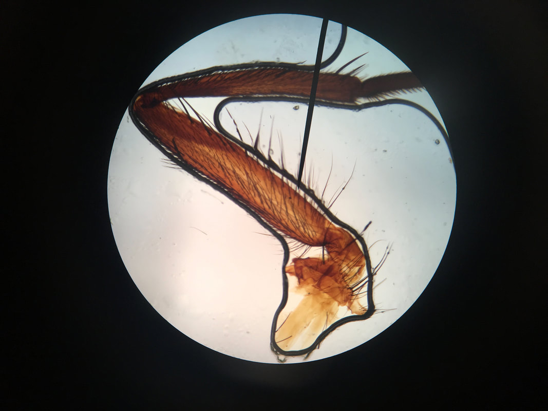
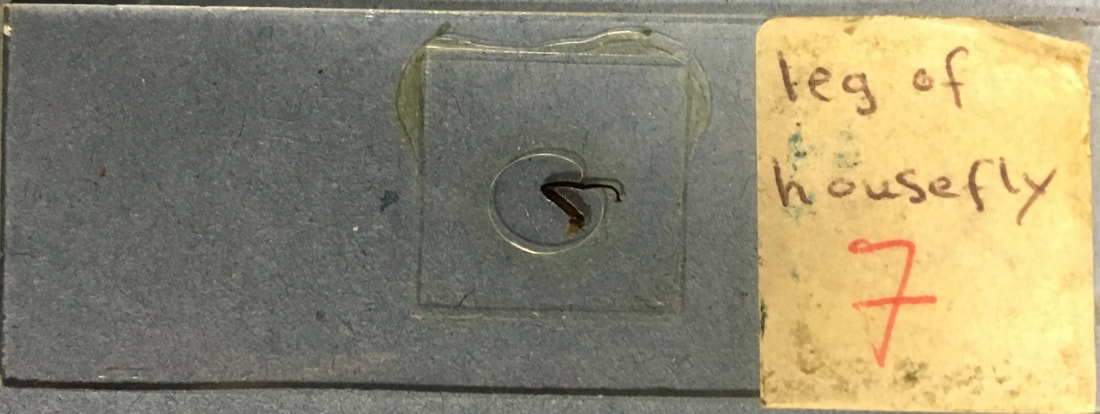
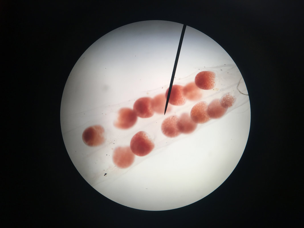
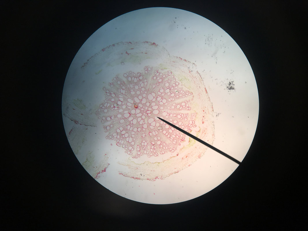
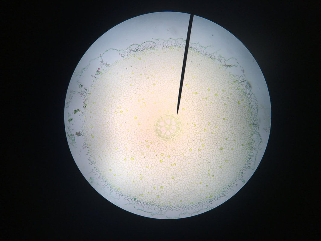
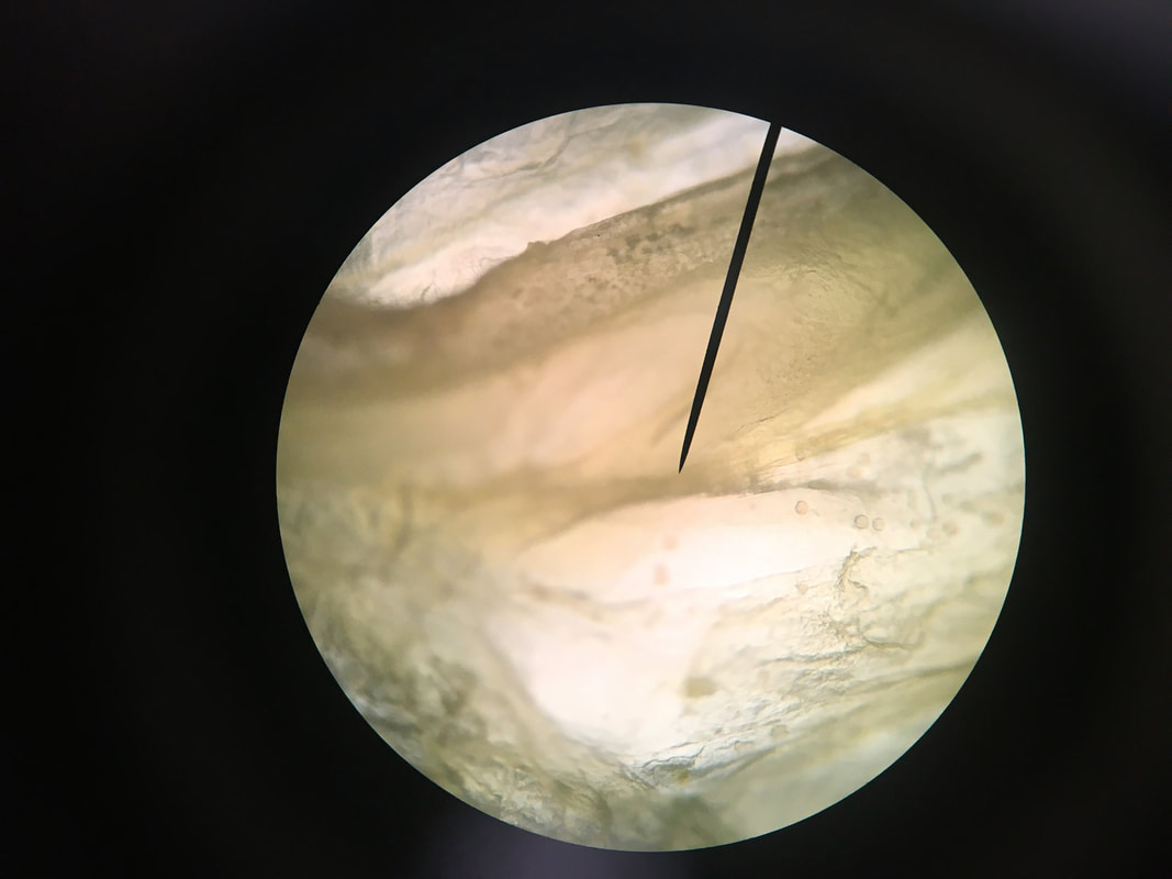
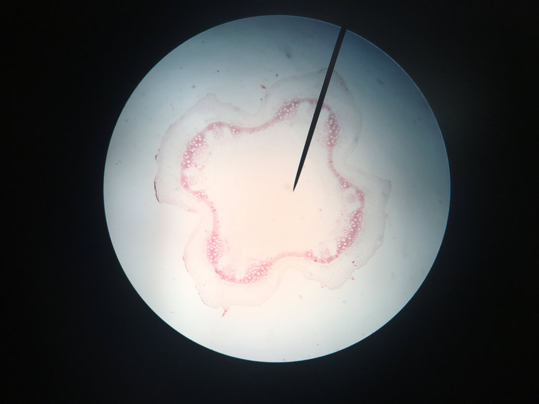
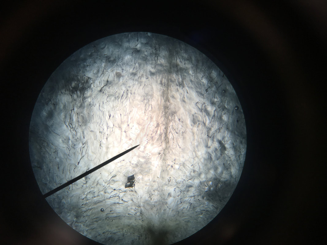
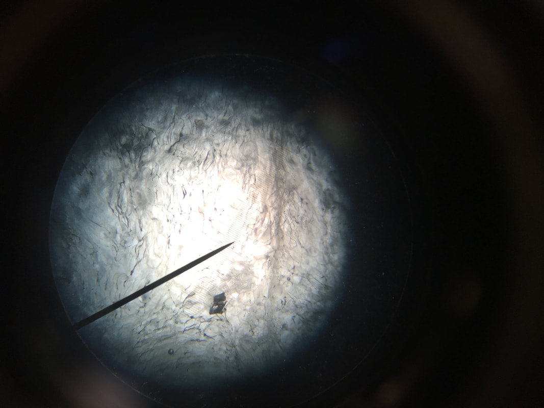
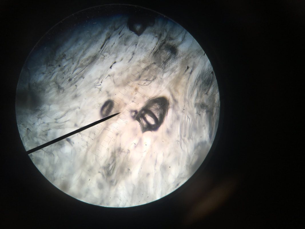
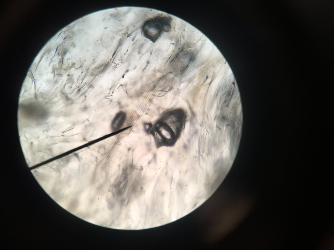
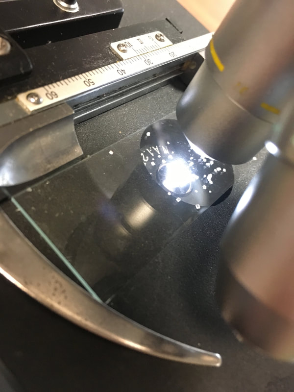
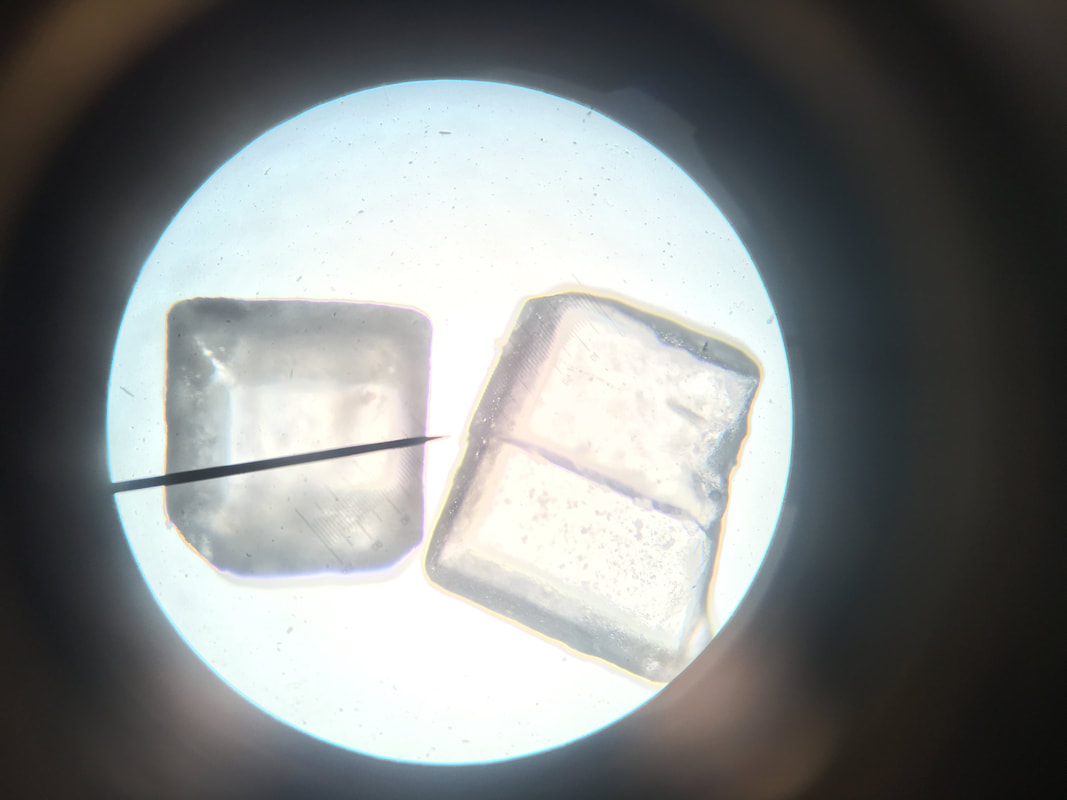
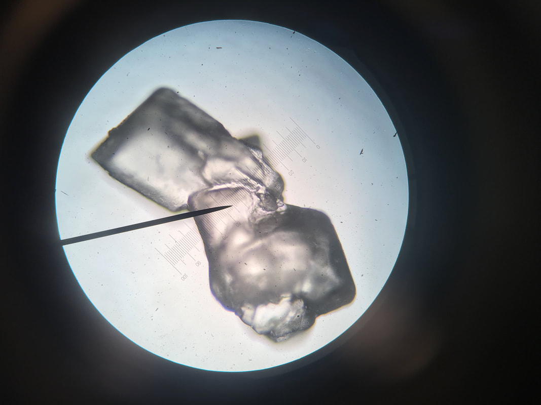
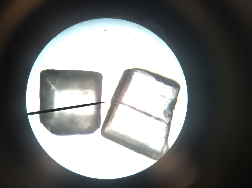
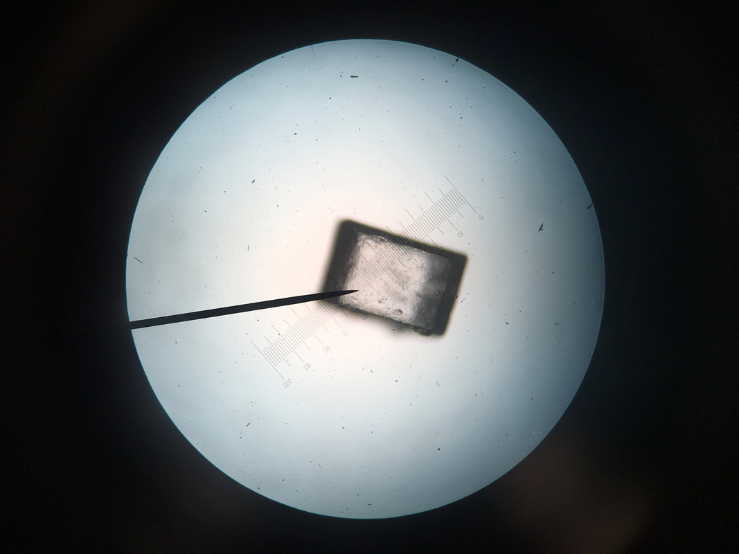
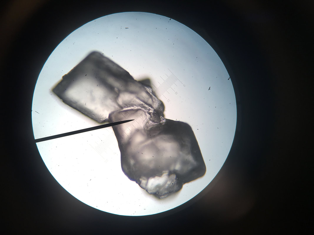
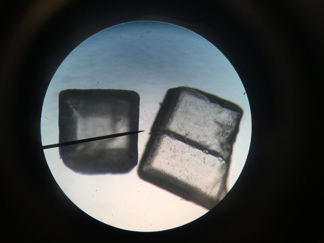
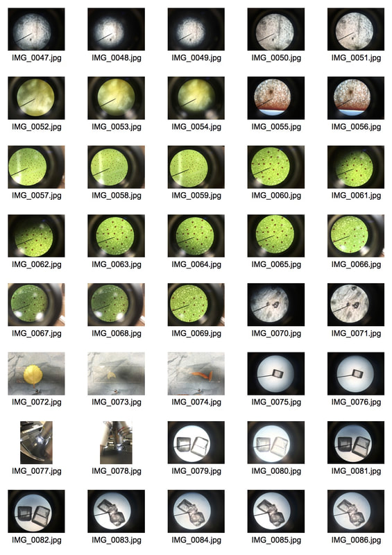
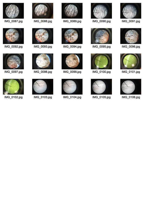
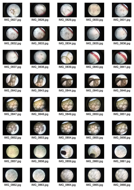
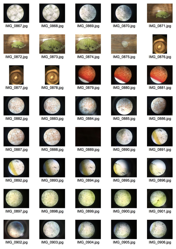
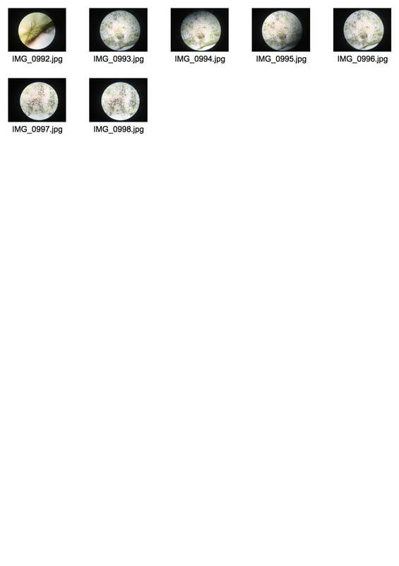
I tried to put lime under the microscope however, because it is not transparent it turned out too dark and you couldn't see the structure I had first anticipated. I then turned to pre-existing slides which I really liked however, it was not what I wanted my development to turn out like. There were many issues with getting the camera lens to focus through the microscope lens.
|
|
|
|
|
|
|
|
|
|
|
|
|
|
|
|
|
|
|
|
|
|
|
|
|
|
|
|
|
|
|

|
|
|
|

|
I decided that I had strayed to far from my original idea and I wanted to strip back my work and look at inspiration once again.
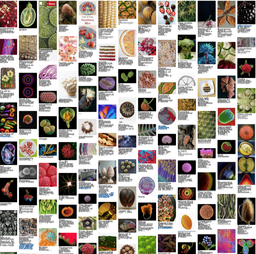
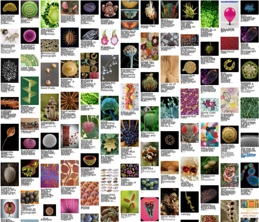
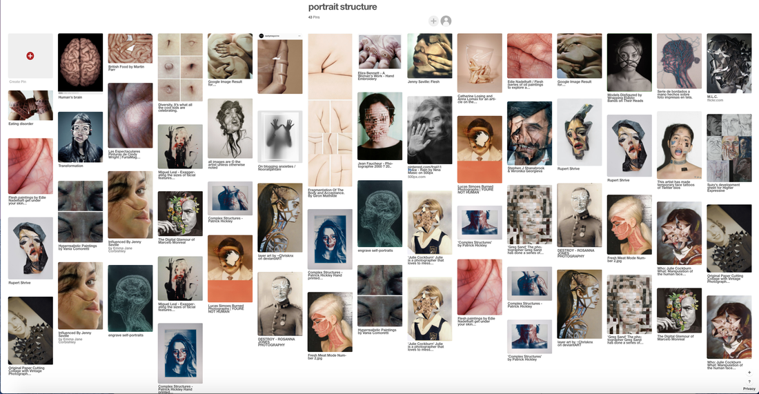
Personally, I felt that the screenshots above of pinterest weren't specific enough and didn't alow me to gather a definitive path. I then searched more specific topics in a bid to find an artist to research as a link.
Here is what I found:
Here is what I found:
|
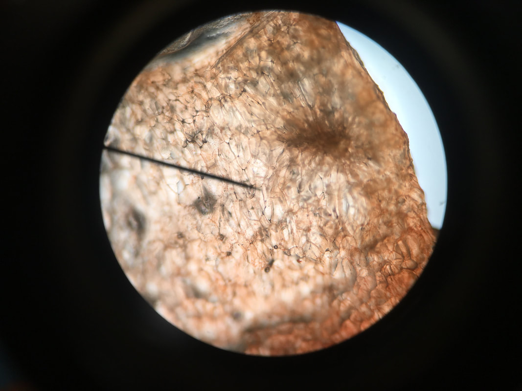
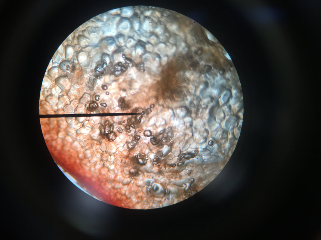
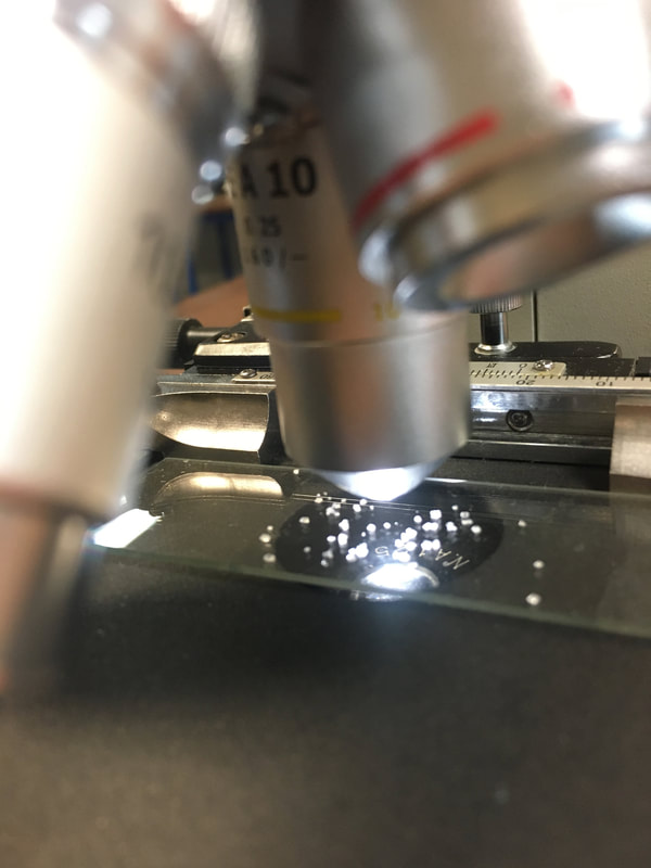
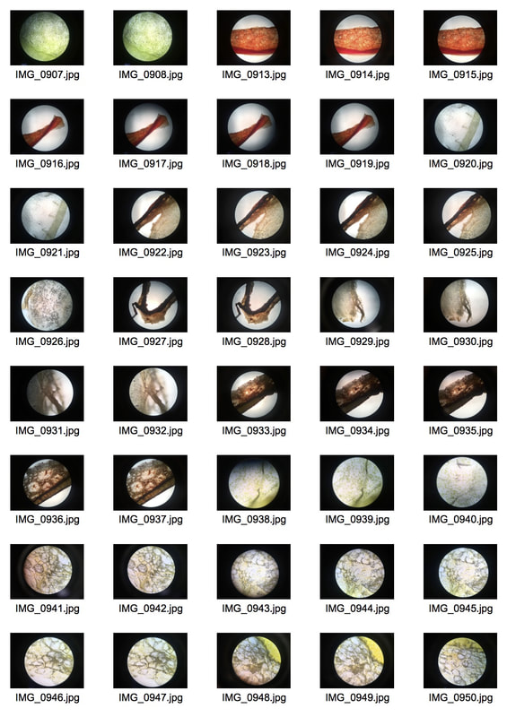
After all my extra research and photographing the pre-existing slides I decided that I would try and create my own slides with a thin layer of epidermis from different types of fruit. This would allow my development to fully link to my initial starting point. To create a slide I used a scalpel to remove a layer of epidermis from the middle of the fruit. I then placed it between two sheets of glass and ready to be placed under the microscope.
|
|
Grape
To photograph grape successfully under the microscope I took a very thin cross-section and placed it on a sheet of glass.
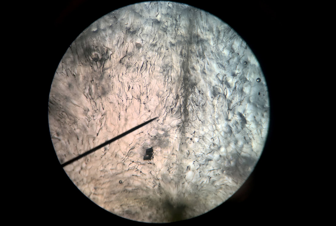
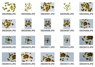
The ones below are the ones that didn't work as well due to the fact it is really difficult to hold the camera in the right position down the microscope in order to get in the whole frame and focus.
|
|
|
|
|
|
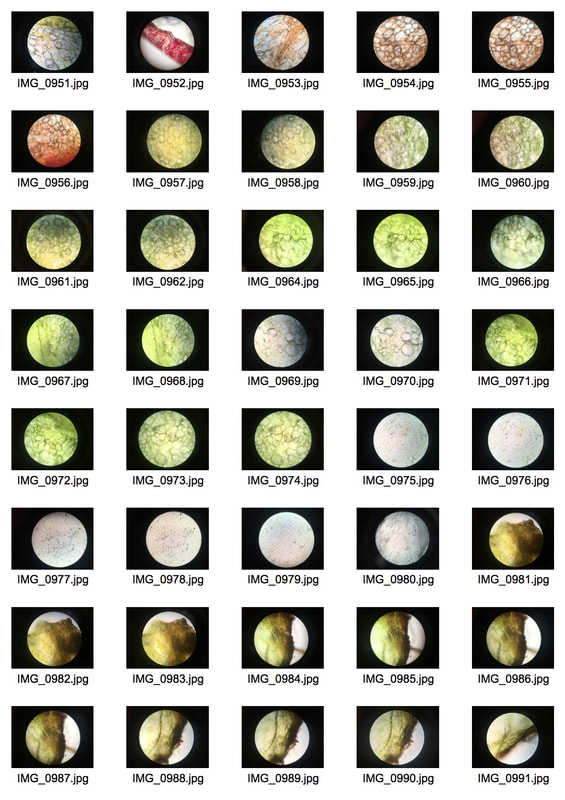
Pepper
I chose pepper as I thought the thin layers and structures within would be interesting magnified.
The pictures below are the ones that didn't come out right, this is due to either focusing, over-exposure or wrong positioning.
|
|
|
|
|
|
After completing grape and pepper. As well as experimenting with orange. I decided to move on to more organic matter. I chose to use an interesting leaf with red pigments in it.
Leaf
I found the leaf very difficult to photograph, it was hard to include the whole leaf magnification in the photo. The ones below are some of the ones that I believe didn't work.
|
|
|
|
|
|
I was also interested in how things like crystals form in nature, the closest thing I had to this was salt crystals.
Salt
|
|
The pictures below show the ones that either didn't work or don't have the correct exposure.
|
|
|
|
|
|
After completing salt magnification, I looked deeper into the formation of crystals in nature. I decided to carry out an experiment on forming crystals. I used salt water on a hot glass sheet and salt water on an extremely cold glass sheet. The cold glass sheet will make the crystals form faster which makes them smaller. The hot glass sheet makes the crystals form slower which makes them larger. I decided to carry out both, the images below show the difference in the formation, the closely knit bubble-like formation is the cold sheet one and the hair-like fragmented formation is the hot sheet one.
Experiment
|
|
After conducting my experiment I decided I had strayed too far from my original series I envisioned. This development helped me eliminate this specific route I could of taken. Putting me closer to my ideal final piece.
In preparation for my final piece
For my final piece, I am creating more slides of a bigger variation of products. In preparation for this, I took more pictures of the cross-sections of different fruits to see which fruits have the most interesting structure. I went back to the process I did before with the light board and the macro lens in order to see the most detail, here are my results:
|
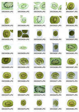
Kiwi
|
To photograph kiwi I cut extremely thin cross-sections in order to look at the whole structure. I had to experiment with the brightness of the light board as if it was too bright, it washed out the detail of the fruit. |
|
Selects
|
Edits
|
|
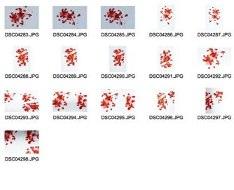
Raspberry
|
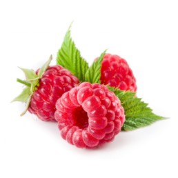
To photograph raspberries, I mashed them up and placed them on the light board, with the naked eye, the structure looked good but, when I took the picture, it didn't quite come out like I envisioned.
|
|
Selects
|
Edits
|
|
Passionfruit
|
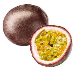
Photographing passionfruit was a lot like raspberries as it was a similar consistency, the result of these wasn't my favourite, nor was the photographing process.
|
|
Selects
|
Edits
|
Final Piece
For my final piece I decided to go back to my favourite previous development, which was magnification. I liked the fact that the product I was photographing was intricate and not seen with the naked eye. My preparation for my final piece allowed me to experiment how different fruits and vegetables photographed and how interesting their structure is. Obviously, every fruit or vegetable under that harsh magnification would exhibit an interesting structure however, I wanted to carefully hand pick the fruit and vegetables I was using.
Florent Tanet
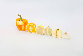
Florent Tanet (1987) is a French photographer and art director working and living in Paris . In 2013 he devoted himself exclusively to photography and art direction with a strong interest for still-life . Multidisciplinary photographer, he works at the intersection of art, sculpture, graphic design and photography. His photos make ordinary scenes and objects into something complex and remarkable. Florent takes complete freedom with the objects and use them as material to create his compositions.
|
|
|
I enjoyed looking at Florent Tanet's work as it inspired me to look deeper at how I could manipulate fruit and vegetables. It's interesting how Tanet chooses to frame her work, I believe this framing contributes to the effectiveness of the image. The simple manipulation of the image makes it unadorned and aesthetically pleasing, upon first look you may even neglect to look at the manipulation, simply viewing it as though the fruits are in their original form.
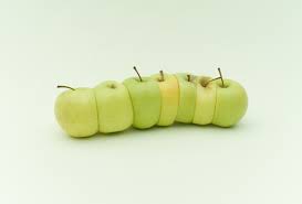
Magnification
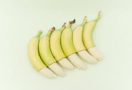
I experimented with a number of different fruit, vegetables and level of magnification. I found that some products showed a more intricate structure than others due to the denseness and how fine I managed to cut it. My favourite was probably the banana skin. Overall, I used kiwi, green grapes, red grapes, banana skin, iodine dyed onion and three different coloured peppers.
|
|
|
Banana
Kiwi
Red Pepper
Yellow Pepper
Green Pepper
Onion
Grape
I am extremely happy with the outcome of my final piece as it has showcased exactly what I had envisioned prior. I wanted to show the structure not visible to the naked eye and I believe I have achieved that. Although I didn't do extensive development between my first idea and my final piece, I went through a number of stages experimenting with different fruits and vegetables. Personally, I think the amount of development was sufficient to aid the success of my final piece.
